
Colors
Colors defines the themes global color palette that other settings and modules reference. It includes five numbered brand colors, five accent colors, and a set of neutral tones used consistently across components.
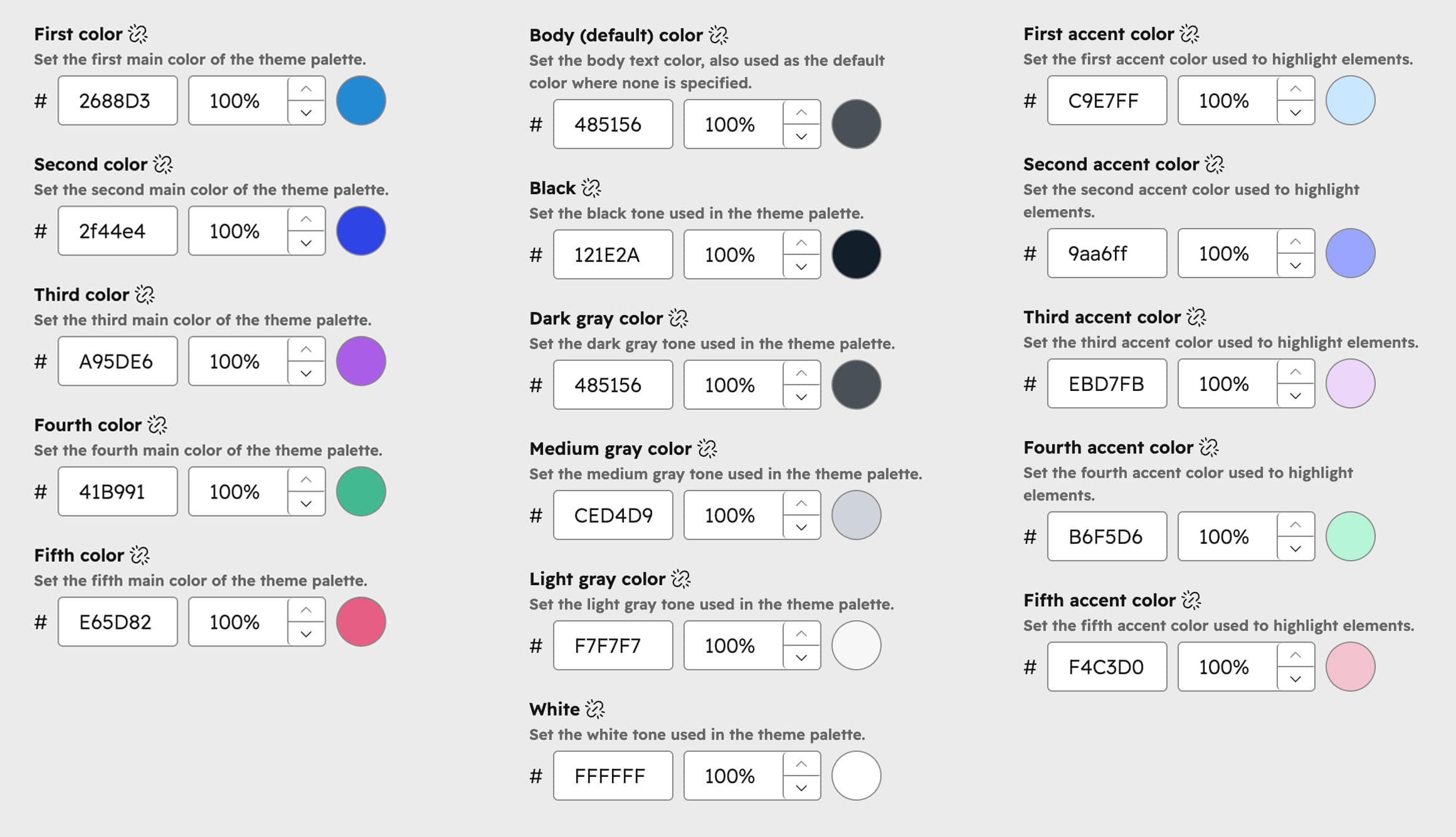
First color
The first main color of the theme palette.
Second color
The second main color of the theme palette.
Third color
The third main color of the theme palette.
Fourth color
The fourth main color of the theme palette.
Fifth color
The fifth main color of the theme palette.
First accent color
The first accent color, used to highlight elements.
Second accent color
The second accent color, used to highlight elements.
Third accent color
The third accent color, used to highlight elements.
Fourth accent color
The fourth accent color, used to highlight elements.
Fifth accent color
The fifth accent color, used to highlight elements.
Body (default) color
The body text color, also used as the default color where none is specified.
Black
The black tone used in the theme palette.
Dark gray color
The dark gray tone used in the theme palette.
Medium gray color
The medium gray tone used in the theme palette.
Light gray color
The light gray tone used in the theme palette.
White
The white tone used in the theme palette.