
Feature
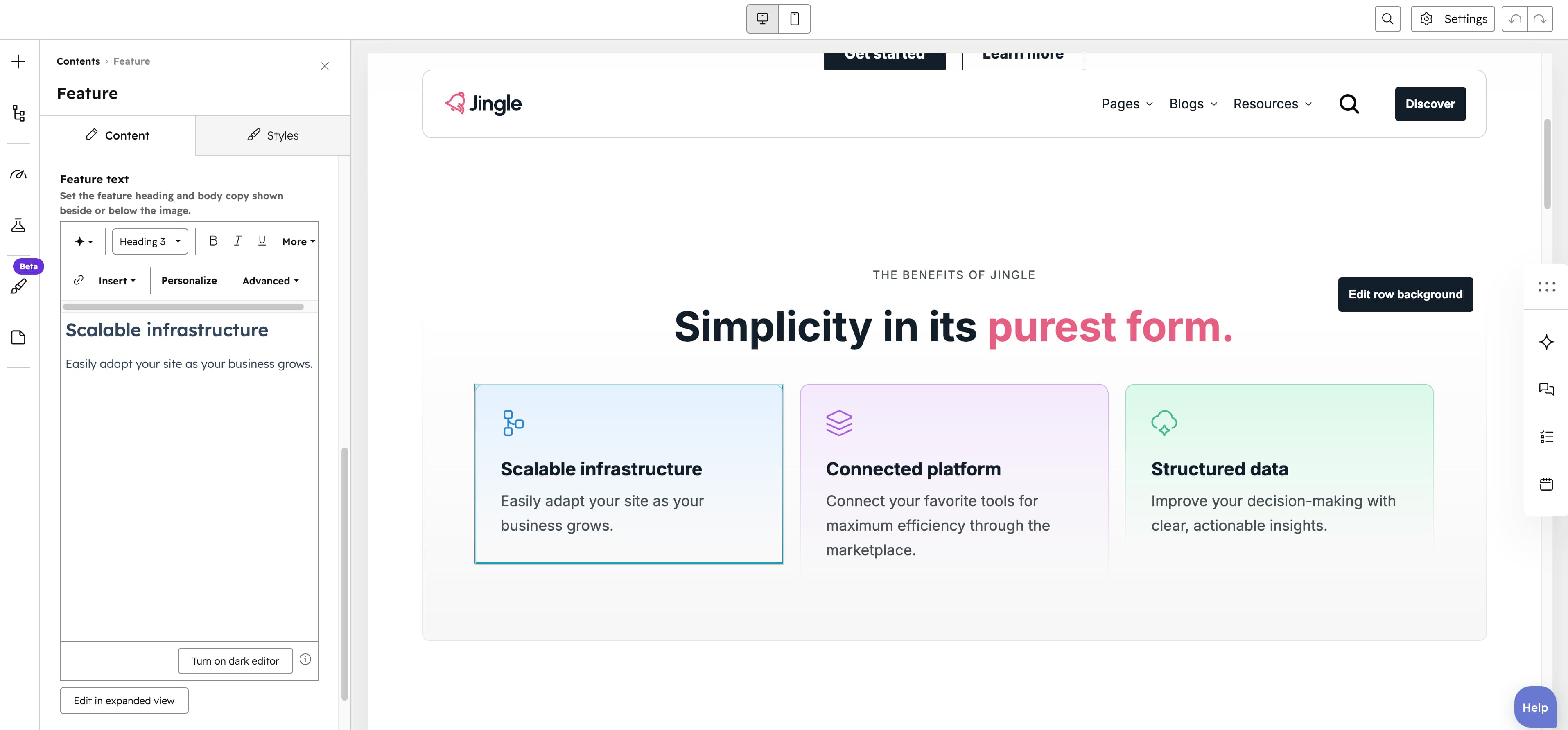
The Feature module displays a feature block built from an icon or image, a rich-text Feature text, and an optional button. SVG images are injected inline as icons, while raster images render responsively with tablet/mobile srcset support. Use it to highlight a product feature, service or benefit, often repeated across a grid layout.
Image
The Image field uploads the feature image or icon along with its alt text; SVG files render as an inline icon while other formats render as a responsive image.
SRC set
The SRC set group provides Tablet image and Mobile image uploads (each with alt text) that replace the desktop image on smaller screens when it is too large.
Feature text
The Feature text rich-text field holds the feature heading and body copy together in a single editable block.
Show button
The Show button toggle (default on) shows or hides the call-to-action button below the feature text; when off, the Button group is hidden.
Button
The Button group (shown when Show button is on) starts with a Button type select — Button (default), Anchor or CTA — which reveals the matching settings. Button settings (Button type) and Anchor settings (Anchor type) share a Button text (default Discover), a Show icon toggle (default off) revealing an Icon upload, a Button style (Plain (default), Plain reversed, Outline, Text only, White or White reversed), a Button theme shown for Outline and Text only styles (Default (default), First color, Second color, Third color, Fourth color, Fifth color or Gray color) and a Make button small toggle (default off); Button type adds a Button URL link, Anchor type adds a Target (for example #id or .class), and CTA type instead shows a CTA field.
Vertical alignment
The Vertical alignment group sets vertical positioning through its Mobile display, Tablet display and Desktop display selects, each offering Top, Center, Bottom, Space around, Space between or Stretch (default Top).
Horizontal alignment
The Horizontal alignment group sets horizontal positioning through its Mobile display, Tablet display and Desktop display selects, each offering Left, Center, Right, Space around, Space between or Stretch (default Left).
Text alignment
The Text alignment group sets text alignment through its Mobile display, Tablet display and Desktop display selects, each offering Left, Center or Right (default Left).
Feature theme
The Feature theme select applies Default (default), First color, Second color, Third color, Fourth color, Fifth color or Gray color to the feature block.
Reverse gradient
The Reverse gradient toggle (default off) reverses the direction of the themes gradient when turned on.
Animation settings
The Animation settings group controls the scroll-into-view animation. Animation type offers None (default), Fade in, Fade up, Fade down, Fade left, Fade right, Zoom in, Zoom out, Slide up, Slide down, Slide left or Slide right; when it is not None, Duration (0.1–3s, step 0.1, default 0.6s), Easing (Smooth (power1.out), Default (power2.out), Snappy (power3.out), Very snappy (expo.out), Sine (sine.out), Overshoot (back.out), Springy (elastic.out), Bouncy (bounce.out) or Linear (none); default Default (power2.out)), Delay (0–5s, step 0.05, default 0s) and, for slide and directional-fade types, Travel distance (0–200px, step 5, default 30px) appear.
Mobile order
The Mobile order slider (-5 to 5, in steps of 1) shifts this module earlier or later than its siblings on mobile; lower numbers appear first.