
Blog posts
The Blog posts module displays a curated set of related posts as cards on blog listing or blog post pages, pulling either the most popular or most recent posts. It can target the current blog or a manually chosen one and can be filtered by tag. Use it to surface recommended or recent reading, such as a You may also like section.
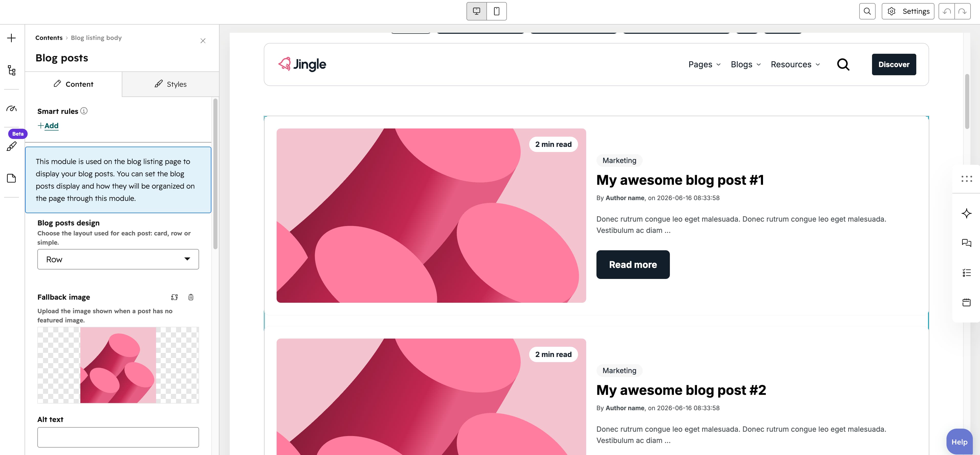
Blog posts design
Blog posts design is a select that sets the layout used for each post: Card (the default), Row or Simple.
Description
Description is an optional rich text field that sets a heading and intro text shown above the posts.
Set blog manually
Set blog manually is a toggle, off by default. When off, posts are pulled from the current blog; when on, the Blog selector appears so you can pull posts from a specific blog instead.
Blog
Blog is a blog picker that chooses which blog to pull posts from; it appears only when Set blog manually is on.
Posts function
Posts function is a select that chooses which posts to pull: Popular (the default) shows the most popular posts, while Recent shows the most recent ones.
Blog posts to show
Blog posts to show is a slider from 1 to 6 in steps of 1, defaulting to 3; it sets how many posts are displayed.
Blog posts per row
Blog posts per row is a slider from 1 to 6 in steps of 1, defaulting to 3; it sets how many posts appear side by side in each row. It is hidden when the Row design is selected.
Filter by blog tag
Filter by blog tag is a toggle, off by default. When on, the Filter tag selector appears and the pulled posts are restricted to that tag; when off, no tag filtering is applied.
Filter tag
Filter tag is a tag picker that chooses the tag used to filter the posts; it appears only when Filter by blog tag is on.
Fallback image
Fallback image is an image field that sets the image shown when a post has no featured image.
Show date
Show date is a toggle, on by default. When on, each posts publish date is shown and the Date text field becomes available; when off, the date is hidden.
Date text
Date text is a text field (default on) that sets the label shown before the publish date; it appears only when Show date is on.
Show author
Show author is a toggle, on by default. When on, each posts author name is shown and the Author text field becomes available; when off, the author is hidden.
Author text
Author text is a text field (default Written by) that sets the label shown before the author name; it appears only when Show author is on.
Show tags
Show tags is a toggle, on by default. When on, each posts tags are shown on the card; when off, they are hidden.
Show read time
Show read time is a toggle, on by default. When on, the estimated reading time is shown on each post card and the Read time text field becomes available; when off, it is hidden.
Read time text
Read time text is a text field (default [time] min read) that sets the read-time label, using the [time] placeholder for the number of minutes; it appears only when Show read time is on.
Button
The Button group configures the button shown on each post card. Button text is a text field defaulting to Discover. Button style is a select defaulting to Plain, with the options Plain, Plain reversed, Outline, Text only, White and White reversed. Show icon is a toggle (off by default) that, when on, adds an Icon image field for an icon beside the text. Make button small is a toggle (off by default) that renders the button at a smaller size.
Vertical alignment
The Vertical alignment group sets how the content aligns vertically, with separate Mobile display, Tablet display and Desktop display selects. Each offers Top, Center, Bottom, Space around, Space between and Stretch; all three default to Top.
Horizontal alignment
The Horizontal alignment group sets how the content aligns horizontally, with separate Mobile display, Tablet display and Desktop display selects. Each offers Left, Center, Right, Space around, Space between and Stretch; all three default to Left.
Text alignment
The Text alignment group sets how the text aligns, with separate Mobile display, Tablet display and Desktop display selects. Each offers Left, Center and Right; all three default to Left.
Animation settings
The Animation settings group controls how the module animates as it scrolls into view. Animation type defaults to None and offers None, Fade in, Fade up, Fade down, Fade left, Fade right, Zoom in, Zoom out, Slide up, Slide down, Slide left and Slide right. When a type other than None is chosen, Duration (0.1 to 3 s, step 0.1, default 0.6 s), Easing and Delay (0 to 5 s, step 0.05, default 0 s) appear. Easing defaults to Default (power2.out) and offers Smooth (power1.out), Default (power2.out), Snappy (power3.out), Very snappy (expo.out), Sine (sine.out), Overshoot (back.out), Springy (elastic.out), Bouncy (bounce.out) and Linear (none). Travel distance (0 to 200 px, step 5, default 30 px) appears only for the directional slide and fade animations, not for None, Fade in, Zoom in or Zoom out.
Mobile order
The Mobile order slider (-5 to 5, step 1) reorders this column on mobile; lower numbers appear first, letting you shift the module up or down relative to sibling modules on mobile screens.