
Search input
The Search input module is a site search field that lets visitors search your HubSpot content and submits to the sites content search results page. It can be shown inline or behind a toggle, and lets you scope which content types are searched, so use it in headers or pages where visitors need to find content quickly.
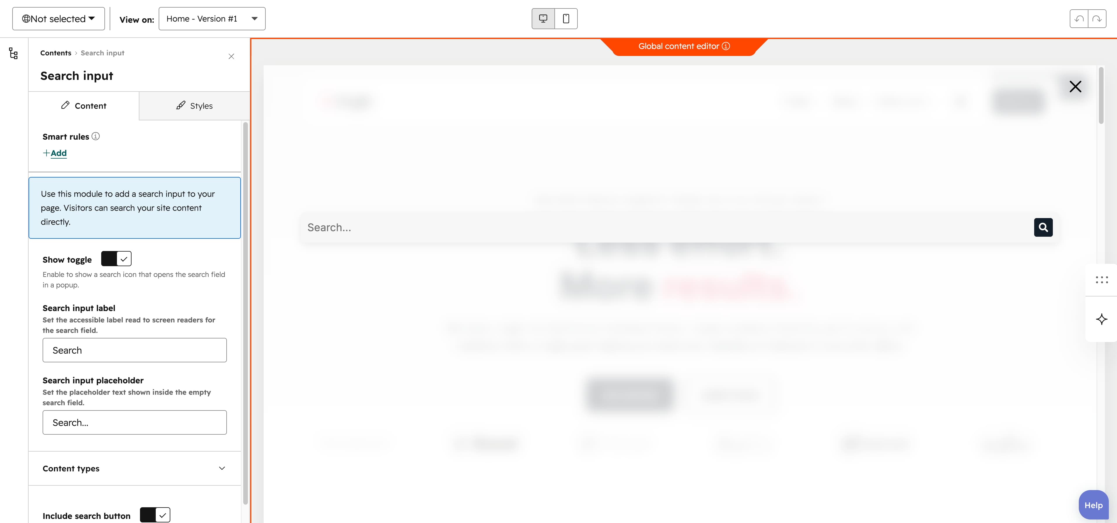
Show toggle
The Show toggle, on by default, renders the search behind a search-icon button that opens the field in a popup; turning it off shows the search field inline at all times.
Search input label
The Search input label field sets the accessible label read to screen readers for the search field (default Search).
Search input placeholder
The Search input placeholder field sets the placeholder text shown inside the empty search field (default Search...).
Content types
The Content types group chooses which sources are searched through four toggles, all on by default: Website pages, Landing pages, Blog posts and Knowledge articles.
Include search button
The Include search button toggle, on by default, adds a submit button with a search icon next to the input field; turn it off to remove it.
Vertical alignment
The Vertical alignment group sets vertical alignment for each screen size through the Mobile display, Tablet display and Desktop display selects, each offering Top, Center, Bottom, Space around, Space between and Stretch (default Center).
Horizontal alignment
The Horizontal alignment group sets horizontal alignment for each screen size through the Mobile display, Tablet display and Desktop display selects, each offering Left, Center, Right, Space around, Space between and Stretch (default Left).
Text alignment
The Text alignment group sets text alignment for each screen size through the Mobile display, Tablet display and Desktop display selects, each offering Left, Center and Right (default Left).
Animation settings
The Animation settings group controls how the module animates into view. Animation type offers None (default), Fade in, Fade up, Fade down, Fade left, Fade right, Zoom in, Zoom out, Slide up, Slide down, Slide left and Slide right. Choosing any type other than None reveals Duration (0.1-3s, step 0.1, default 0.6s), Easing (Smooth (power1.out), Default (power2.out) [default], Snappy (power3.out), Very snappy (expo.out), Sine (sine.out), Overshoot (back.out), Springy (elastic.out), Bouncy (bounce.out) or Linear (none)) and Delay (0-5s, step 0.05, default 0s), while Travel distance (0-200px, step 5, default 30px) appears only for slide and directional fade animations.
Mobile order
The Mobile order slider ranges from -5 to 5 in steps of 1 and lets you shift the module up or down relative to sibling modules on mobile screens; lower numbers appear first.