
Key number
The Key number module is a compact statistic block that displays a single key number with a description and optional prefix/suffix symbols, intended to highlight metrics or achievements on landing and site pages. It can animate the number with a counting effect when it enters the viewport. Use it to call out figures like percentages, counts or growth metrics.
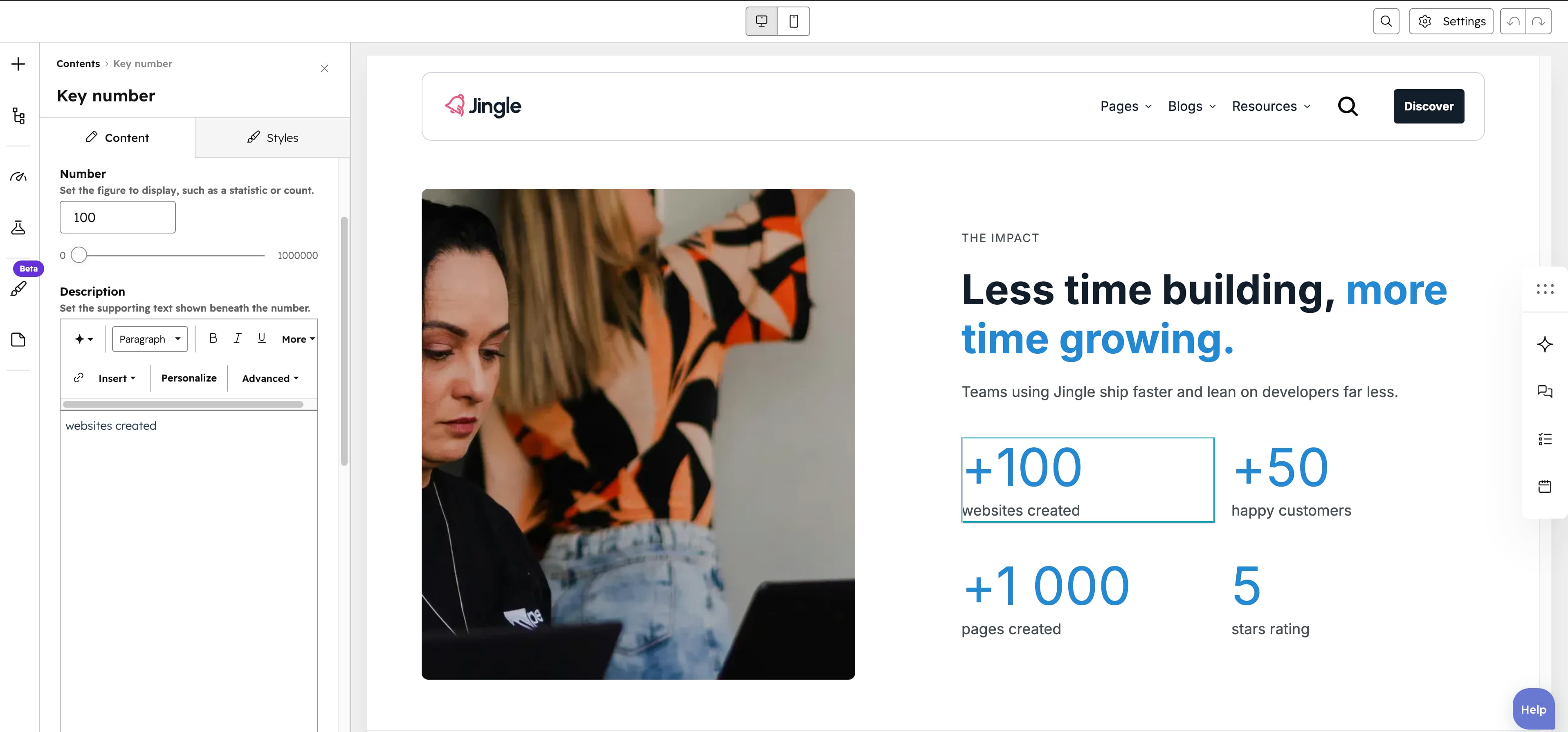
Number
The Number slider sets the figure to display (up to 1,000,000, step 1, default 25).
Show symbol
The Show symbol toggle (default off) displays a symbol beside the number; turning it on reveals the Symbol, Show symbol first and Enable key number animation fields.
Symbol
The Symbol text field (default +), shown when Show symbol is on, sets the symbol displayed beside the number, for example + or $.
Show symbol first
The Show symbol first toggle (default on), shown when Show symbol is on, places the symbol before the number; turn it off to place it after.
Show additional symbol
The Show additional symbol toggle (default off) adds a second symbol after the number.
Additional symbol
The Additional symbol text field (default %), shown when Show additional symbol is on, sets the secondary symbol displayed after the number.
Enable key number animation
The Enable key number animation toggle (default on), shown when Show symbol is on, counts the number up from zero when it scrolls into view.
Animation duration
The Animation duration field (1–20 seconds, step 1, default 2), shown when Enable key number animation is on, sets how long the count-up runs.
Description
The Description rich-text field holds the supporting text shown beneath the number.
Vertical alignment
The Vertical alignment group sets vertical positioning through its Mobile display, Tablet display and Desktop display selects, each offering Top, Center, Bottom, Space around, Space between or Stretch (default Top).
Horizontal alignment
The Horizontal alignment group sets horizontal positioning through its Mobile display, Tablet display and Desktop display selects, each offering Left, Center, Right, Space around, Space between or Stretch (default Left).
Text alignment
The Text alignment group sets text alignment through its Mobile display, Tablet display and Desktop display selects, each offering Left, Center or Right (default Left).
Key number theme
The Key number theme select applies Default (default), First color, Second color, Third color, Fourth color, Fifth color or Gray color to the number and its text.
Animation settings
The Animation settings group controls the scroll-into-view animation. Animation type offers None (default), Fade in, Fade up, Fade down, Fade left, Fade right, Zoom in, Zoom out, Slide up, Slide down, Slide left or Slide right; when it is not None, Duration (0.1–3s, step 0.1, default 0.6s), Easing (Smooth (power1.out), Default (power2.out), Snappy (power3.out), Very snappy (expo.out), Sine (sine.out), Overshoot (back.out), Springy (elastic.out), Bouncy (bounce.out) or Linear (none); default Default (power2.out)), Delay (0–5s, step 0.05, default 0s) and, for slide and directional-fade types, Travel distance (0–200px, step 5, default 30px) appear.
Mobile order
The Mobile order slider (-5 to 5, in steps of 1) shifts this module earlier or later than its siblings on mobile; lower numbers appear first.