
Menu
The Menu module renders a chosen HubSpot menu either vertically or horizontally, recursing through nested levels up to a configurable depth. It can show an optional title and, in horizontal mode, includes a mobile toggle. Use it for sidebar menus, footer menus or secondary horizontal navigation.
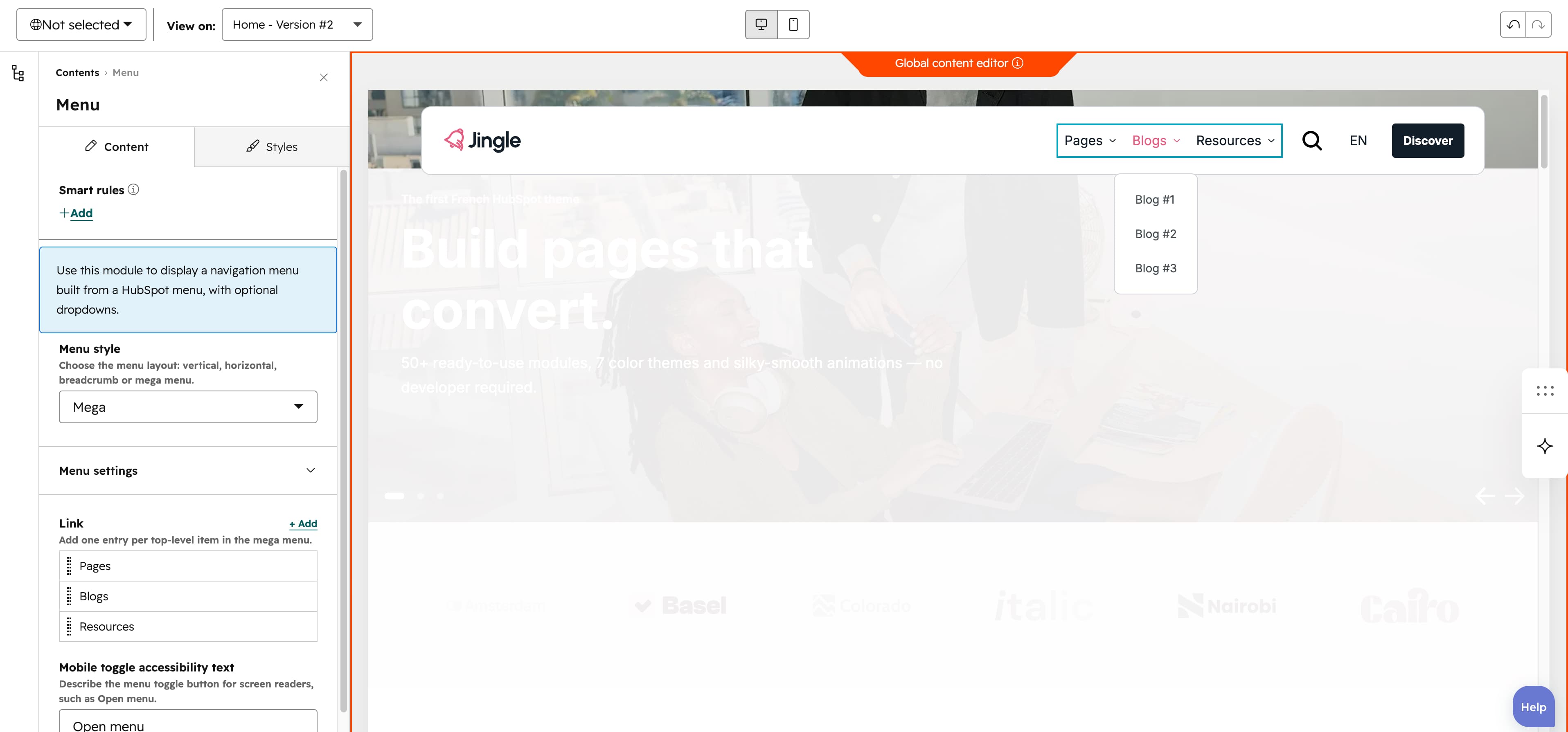
Menu style
The Menu style select chooses the layout and offers Vertical, Horizontal, Breadcrumb and Mega (the default); it also controls whether the mobile toggle is rendered.
Menu
The Menu field, inside the Menu settings group, selects which HubSpot menu to render; it is empty by default until you pick a menu.
Max levels
The Max levels slider (minimum 1, maximum 10, step 1, default 10) caps how many levels of nested menu items are expanded.
Enable flyouts
The Enable flyouts toggle (on by default), inside the Menu settings group, reveals child items in flyout panels on hover for non-mega menus; turn it off to disable the hover flyouts.
Show menu title
The Show menu title toggle (on by default) shows a title above the menu, output as the first item of the top-level list; turning it off hides the title and the Menu title field.
Menu title
The Menu title field sets that title text (default Products) and is shown only when Show menu title is enabled.
Mobile toggle accessibility text
The Mobile toggle accessibility text field sets the aria-label of the burger toggle button used on mobile screens (default Open menu).
Link
The repeatable Link group (four items by default) defines the mega menus top-level items. Each item has Text (default Services), a Url shown only when Add submenu is off, an Image with a SRC set group (Tablet image and Mobile image), and an Add submenu toggle (on by default). When Add submenu is on, a repeatable Submenu column group (three by default) appears, whose Column type can be Column menu (the default), Simple menu, CTA or Image.
Vertical alignment
The Vertical alignment group sets how the menu aligns vertically at each breakpoint through three selects — Mobile display, Tablet display and Desktop display. Each offers Top (the default), Center, Bottom, Space around, Space between and Stretch.
Horizontal alignment
The Horizontal alignment group sets the horizontal alignment per breakpoint through Mobile display, Tablet display and Desktop display selects. Each offers Left (the default), Center, Right, Space around, Space between and Stretch.
Text alignment
The Text alignment group aligns the text per breakpoint through Mobile display, Tablet display and Desktop display selects, each offering Left (the default), Center and Right.
Animation settings
The Animation settings group controls the scroll-into-view entrance. Animation type selects the effect — None (the default), Fade in, Fade up, Fade down, Fade left, Fade right, Zoom in, Zoom out, Slide up, Slide down, Slide left or Slide right. When a type other than None is chosen, Duration (0.1–3s, step 0.1, default 0.6s), Easing (Smooth (power1.out), Default (power2.out) the default, Snappy (power3.out), Very snappy (expo.out), Sine (sine.out), Overshoot (back.out), Springy (elastic.out), Bouncy (bounce.out) or Linear (none)) and Delay (0–5s, step 0.05, default 0s) appear. Travel distance (0–200px, step 5, default 30px) additionally appears for slide and directional-fade animations, and stays hidden for None, Fade in, Zoom in and Zoom out.