Buttons
Buttons defines the global appearance of button elements throughout the theme, covering typography, default and hover colors, borders, and responsive sizing. These settings ensure buttons stay visually consistent across modules.
Font weight
The font weight used for button text.
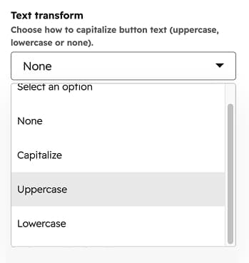
Text transform
How button text is capitalized (None, Capitalize, Uppercase, Lowercase).
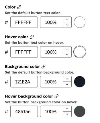
Color
The default button text color.
Hover color
The button text color on hover.
Background color
The default button background color.
Hover background color
The button background color on hover.
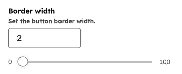
Border width
The button border width.
Border color
The default button border color.
Hover border color
The button border color on hover.
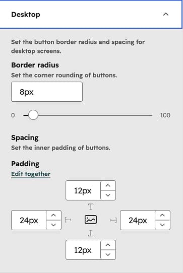
Desktop
The button Border radius and Spacing (inner padding) used on desktop screens.
Tablet
The button Border radius and Spacing (inner padding) used on tablet screens.
Mobile
The button Border radius and Spacing (inner padding) used on mobile screens.