
Row background
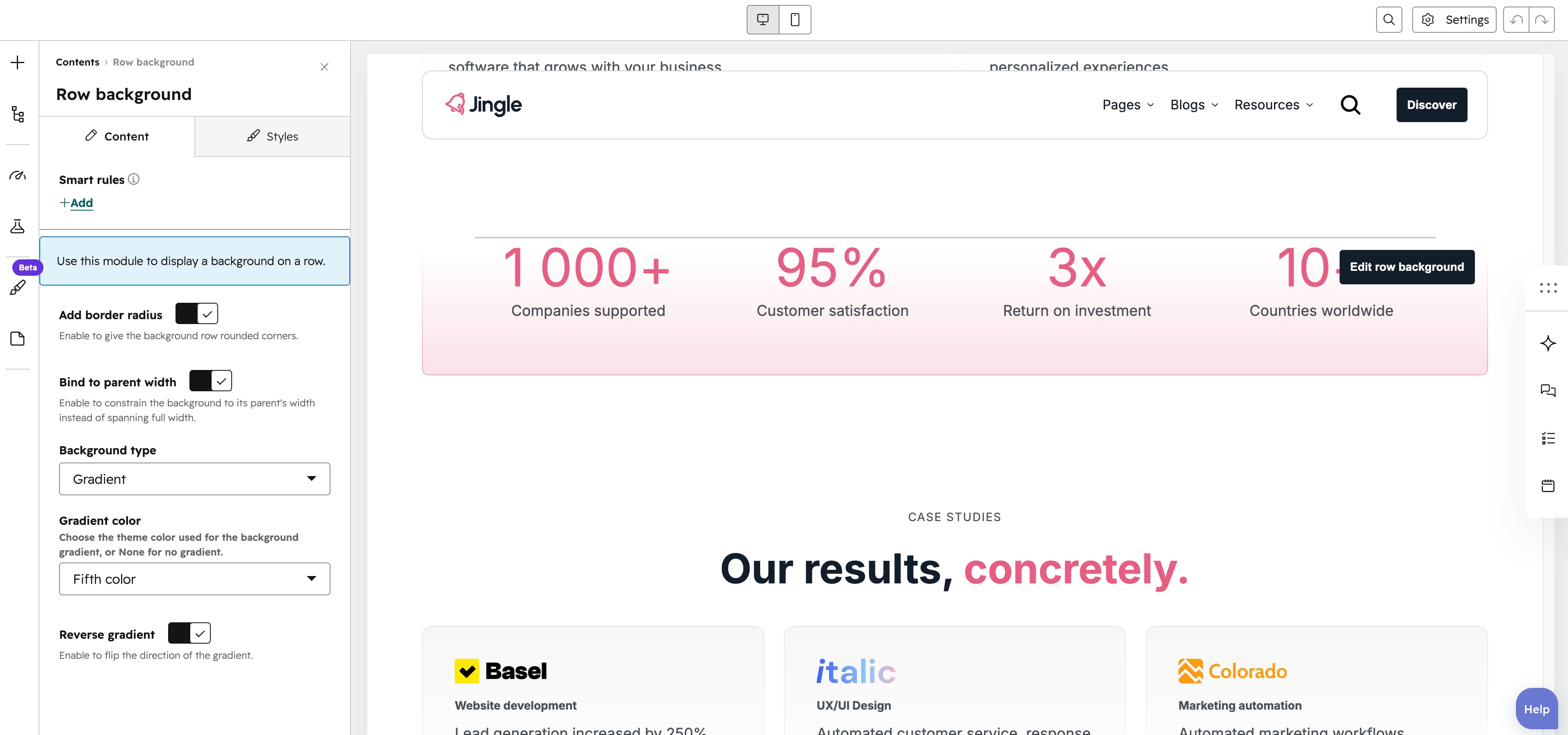
The Row background module renders an empty styled container that acts as a decorative gradient layer for a row rather than holding any content. It is well suited to placing behind other modules in a row when you want to add a colored gradient backdrop with optional rounded corners to a section.
Add border radius
The Add border radius toggle (on by default) rounds the containers corners; turn it off for square corners.
Bind to parent width
The Bind to parent width toggle (on by default) constrains the background to its parents width; turn it off to let it span the full width.
Background type
The Background type select chooses between a Gradient (default) and an Image background; the choice controls which of the fields below are shown.
Image
The Image field, shown when Background type is Image, sets the background image with its alt text.
SRC set
The SRC set group, also shown for an image background, provides smaller Tablet image and Mobile image variants for smaller layouts or better performance.
Gradient color
The Gradient color select, shown when Background type is Gradient, applies the gradient color: First color, Second color, Third color, Fourth color, Fifth color, Gray color (default) or None (no gradient).
Reverse gradient
The Reverse gradient toggle (off by default), shown for a gradient background, flips the direction of the chosen gradient.
Animation settings
The Animation settings group controls the scroll-into-view animation. Animation type chooses the entrance effect — None (default), Fade in, Fade up, Fade down, Fade left, Fade right, Zoom in, Zoom out, Slide up, Slide down, Slide left or Slide right. When a type other than None is chosen, Duration (0.1 to 3s, step 0.1, default 0.6s), Easing (Smooth (power1.out), Default (power2.out) [default], Snappy (power3.out), Very snappy (expo.out), Sine (sine.out), Overshoot (back.out), Springy (elastic.out), Bouncy (bounce.out) or Linear (none)) and Delay (0 to 5s, step 0.05, default 0s) appear, and Travel distance (0 to 200px, step 5, default 30px) is shown for slide and directional fade animations.
Mobile order
The Mobile order slider ranges from -5 to 5 (step 1); lower numbers appear first, letting you shift the module up or down relative to sibling modules on mobile screens.