
Social follow
The Social follow module displays a set of social media icon links inviting visitors to follow the company, with an optional rich-text description above the icons. Each social entry is fully repeatable with its own icon, URL and accessibility label, making it well suited to footers or contact sections where you want to surface social profiles.
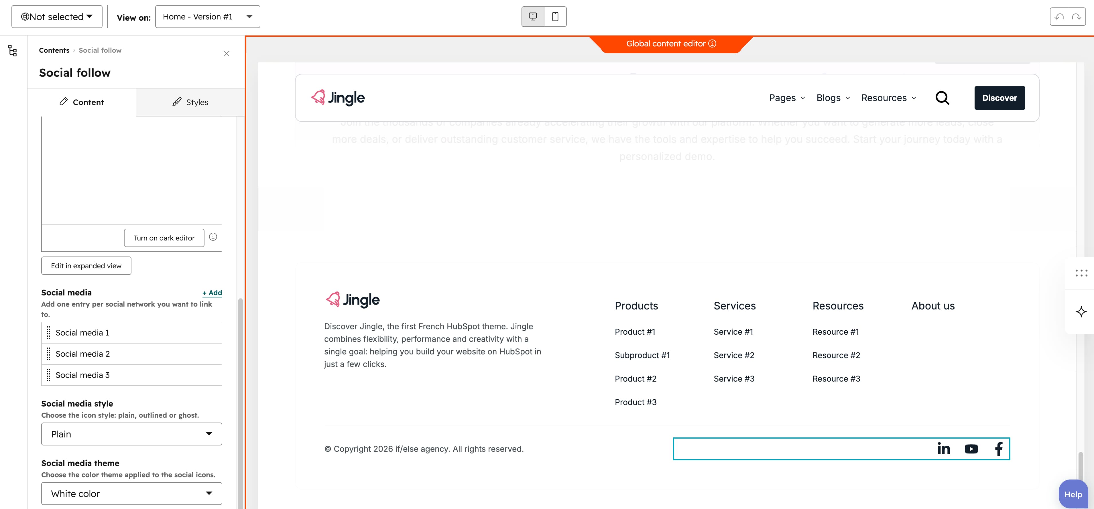
Description
The optional Description rich-text field renders an optional heading or description above the icon row.
Social media
The Social media group is repeatable with no maximum (minimum 1, 4 created by default). Each item has a Social icon from the Font Awesome 6.4.2 set, a Social URL link accepting external, content, file, email and blog targets, and an Accessibility text used as the icons aria-label (for example, Follow us on Facebook).
Social media style
The Social media style select chooses the icon treatment: Plain (default), Outline or Ghost.
Social media theme
The Social media theme select colors the icons: Default, First color, Second color, Third color, Fourth color, Fifth color, Gray color or White color (default).
Vertical alignment
The Vertical alignment group sets vertical alignment per screen size through Mobile display, Tablet display and Desktop display selects; each offers Top (default), Center, Bottom, Space around, Space between and Stretch.
Horizontal alignment
The Horizontal alignment group sets horizontal alignment per screen size through Mobile display, Tablet display and Desktop display selects; each offers Left (default), Center, Right, Space around, Space between and Stretch.
Text alignment
The Text alignment group sets text alignment per screen size through Mobile display, Tablet display and Desktop display selects; each offers Left (default), Center and Right.
Animation settings
The Animation settings group controls the scroll-into-view animation. Animation type chooses the entrance effect — None (default), Fade in, Fade up, Fade down, Fade left, Fade right, Zoom in, Zoom out, Slide up, Slide down, Slide left or Slide right. When a type other than None is chosen, Duration (0.1 to 3s, step 0.1, default 0.6s), Easing (Smooth (power1.out), Default (power2.out) [default], Snappy (power3.out), Very snappy (expo.out), Sine (sine.out), Overshoot (back.out), Springy (elastic.out), Bouncy (bounce.out) or Linear (none)) and Delay (0 to 5s, step 0.05, default 0s) appear, and Travel distance (0 to 200px, step 5, default 30px) is shown for slide and directional fade animations.
Mobile order
The Mobile order slider ranges from -5 to 5 (step 1); lower numbers appear first, letting you shift the module up or down relative to sibling modules on mobile screens.