
Logos grid
The Logos grid module displays a static grid of logos, making it ideal for client or partner walls. Each logo supports an optional link and tablet/mobile srcset, while shared max-width and max-height settings keep every logo visually consistent. Use it when you want to showcase a set of brands in a clean, evenly proportioned grid.
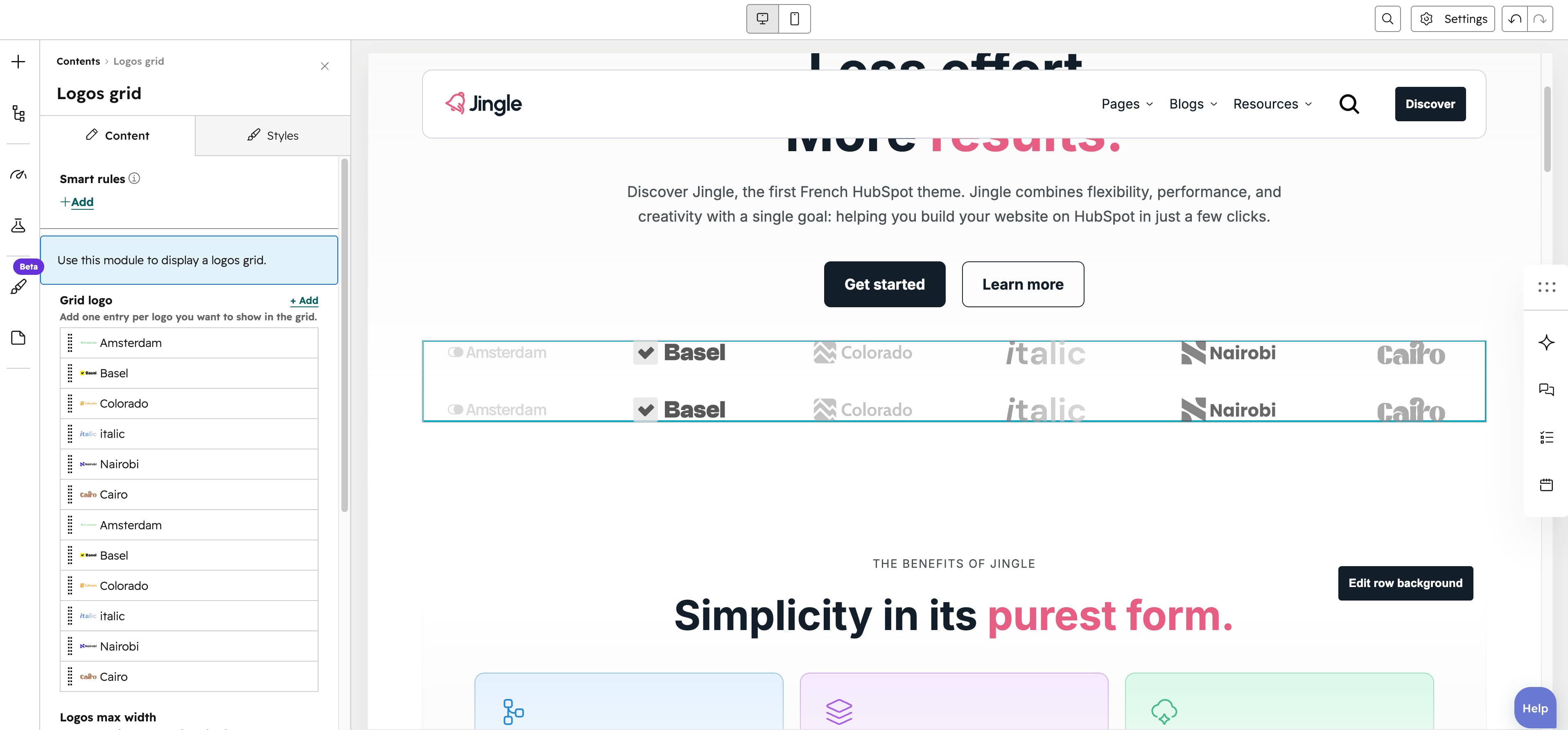
Grid logo
The Grid logo group is repeatable (minimum 1, unlimited maximum, 6 items by default). Each entry has a Logo image upload, an optional SRC set group (Tablet image and Mobile image) and an optional Link (External, Content or Blog).
Logos max width
The Logos max width field caps each logos width (20–300px, step 1, default 120px).
Logos max height
The Logos max height field caps each logos height (20–300px, step 1, default 60px).
Logos style
The Logos style select renders logos in Default (full color) or Grayscale (default).
Logos per row
The Logos per row group sets the column count via its Mobile display (default 2), Tablet display (default 3) and Desktop display (default 6) sliders, each ranging from 1 to 6.
Grid gap
The Grid gap group sets the spacing between logos via its Mobile display, Tablet display and Desktop display sliders (0–180px, step 4, default 40px).
Vertical alignment
The Vertical alignment group sets vertical positioning through its Mobile display, Tablet display and Desktop display selects, each offering Top, Center, Bottom, Space around, Space between or Stretch (default Top).
Horizontal alignment
The Horizontal alignment group sets horizontal positioning through its Mobile display, Tablet display and Desktop display selects, each offering Left, Center, Right, Space around, Space between or Stretch (default Left).
Text alignment
The Text alignment group sets text alignment through its Mobile display, Tablet display and Desktop display selects, each offering Left, Center or Right (default Left).
Animation settings
The Animation settings group controls the scroll-into-view animation. Animation type offers None (default), Fade in, Fade up, Fade down, Fade left, Fade right, Zoom in, Zoom out, Slide up, Slide down, Slide left or Slide right; when it is not None, Duration (0.1–3s, step 0.1, default 0.6s), Easing (Smooth (power1.out), Default (power2.out), Snappy (power3.out), Very snappy (expo.out), Sine (sine.out), Overshoot (back.out), Springy (elastic.out), Bouncy (bounce.out) or Linear (none); default Default (power2.out)), Delay (0–5s, step 0.05, default 0s) and, for slide and directional-fade types, Travel distance (0–200px, step 5, default 30px) appear.
Mobile order
The Mobile order slider (-5 to 5, in steps of 1) shifts this module earlier or later than its siblings on mobile; lower numbers appear first.