
Card
The Card module displays a single content card built from an image, a rich-text Description, and an optional button, with optional date and category metadata. It supports a Standard layout (image above text) or a Cover layout where the image becomes a full background with text overlaid. Use it for content tiles such as blog teasers, portfolio entries, or promotional blocks.
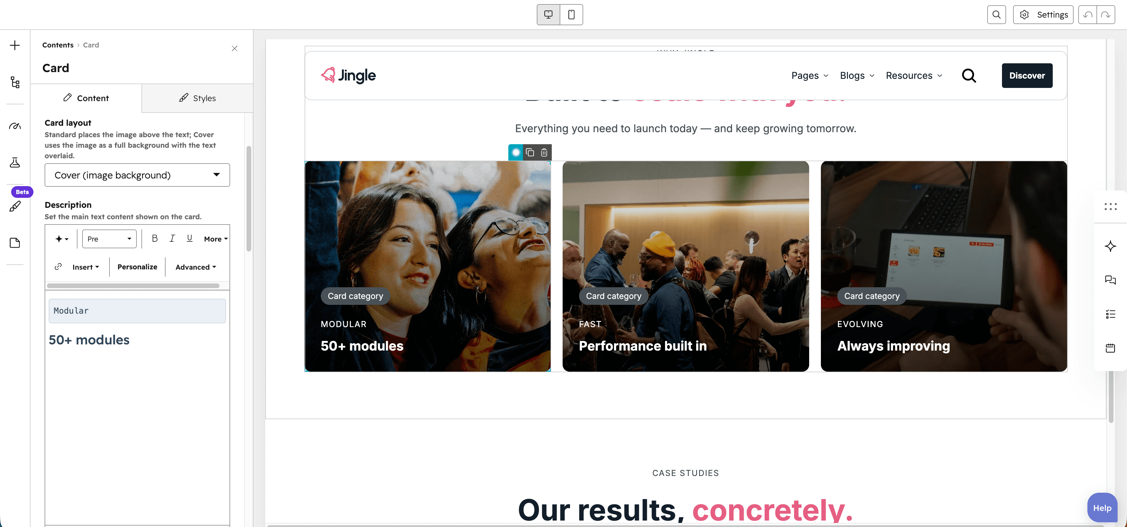
Card layout
The Card layout select offers Standard (default), which places the image above the text, and Cover (image background), which uses the image as a full-bleed background with the text overlaid.
Description
The Description rich-text field holds the cards title and body copy, which you can format freely.
Image
The Image field holds the cards main image (with alt text), shown above the text in Standard layout or as the background in Cover layout.
SRC set
The SRC set group provides responsive sources: a Tablet image and a Mobile image, each with alt text, useful when the desktop image is too large for smaller layouts or for performance.
Show date
The Show date toggle is off by default. When on, it reveals the Date field so a date appears on the card.
Date
The Date text field sets the date shown on the card (default September 20th 2024); it is visible only when Show date is on.
Show category
The Show category toggle is on by default. When on, it reveals the Category field so a category label appears on the card.
Category
The Category rich-text field sets the category shown on the card (default Card category); it is visible only when Show category is on.
Show button
The Show button toggle is on by default. When on, it reveals the Button group so the card displays a button.
Button
The Button group configures the cards button. Button type offers Button (default), Anchor and CTA: Button uses a Button text and Button URL link, Anchor uses a Target (#id or .class), and CTA uses a HubSpot CTA. A Show icon toggle reveals an Icon image, a Button style offers Plain (default), Plain reversed, Outline, Text only, White or White reversed, a Button theme (shown for Outline and Text only) offers Default, First color through Fifth color or Gray color, and a Make button small toggle reduces its size.
Horizontal alignment
The Horizontal alignment group sets how the card content aligns horizontally through separate Mobile display, Tablet display and Desktop display selects, each offering Left (default), Center, Right, Space around, Space between and Stretch.
Text alignment
The Text alignment group sets how the card text aligns through separate Mobile display, Tablet display and Desktop display selects, each offering Left (default), Center and Right.
Card theme
The Card theme select styles the card with Default (default), First color, Second color, Third color, Fourth color, Fifth color or Gray color.
Reverse gradient
The Reverse gradient toggle is off by default; when on, it reverses the direction of the cards gradient overlay.
Animation settings
The Animation settings group animates the module as it scrolls into view. Animation type offers None (default), Fade in, Fade up, Fade down, Fade left, Fade right, Zoom in, Zoom out, Slide up, Slide down, Slide left and Slide right. When an animation is active it reveals Duration (0.1 to 3s, step 0.1, default 0.6s), Easing (Smooth (power1.out), Default (power2.out) as the default, Snappy (power3.out), Very snappy (expo.out), Sine (sine.out), Overshoot (back.out), Springy (elastic.out), Bouncy (bounce.out) or Linear (none)), Delay (0 to 5s, step 0.05, default 0s) and Travel distance (0 to 200px, step 5, default 30px, shown for slide and directional-fade animations).
Mobile order
The Mobile order slider (min -5, max 5, step 1) shifts the module up or down relative to sibling modules on mobile screens; lower numbers appear first.