
Step
The Step module is a single step block for process or how-it-works sections, showing either a number or an icon alongside a rich-text title and description. It is designed to be repeated across a page to form a step-by-step sequence, so use it to outline processes, instructions, or stages.
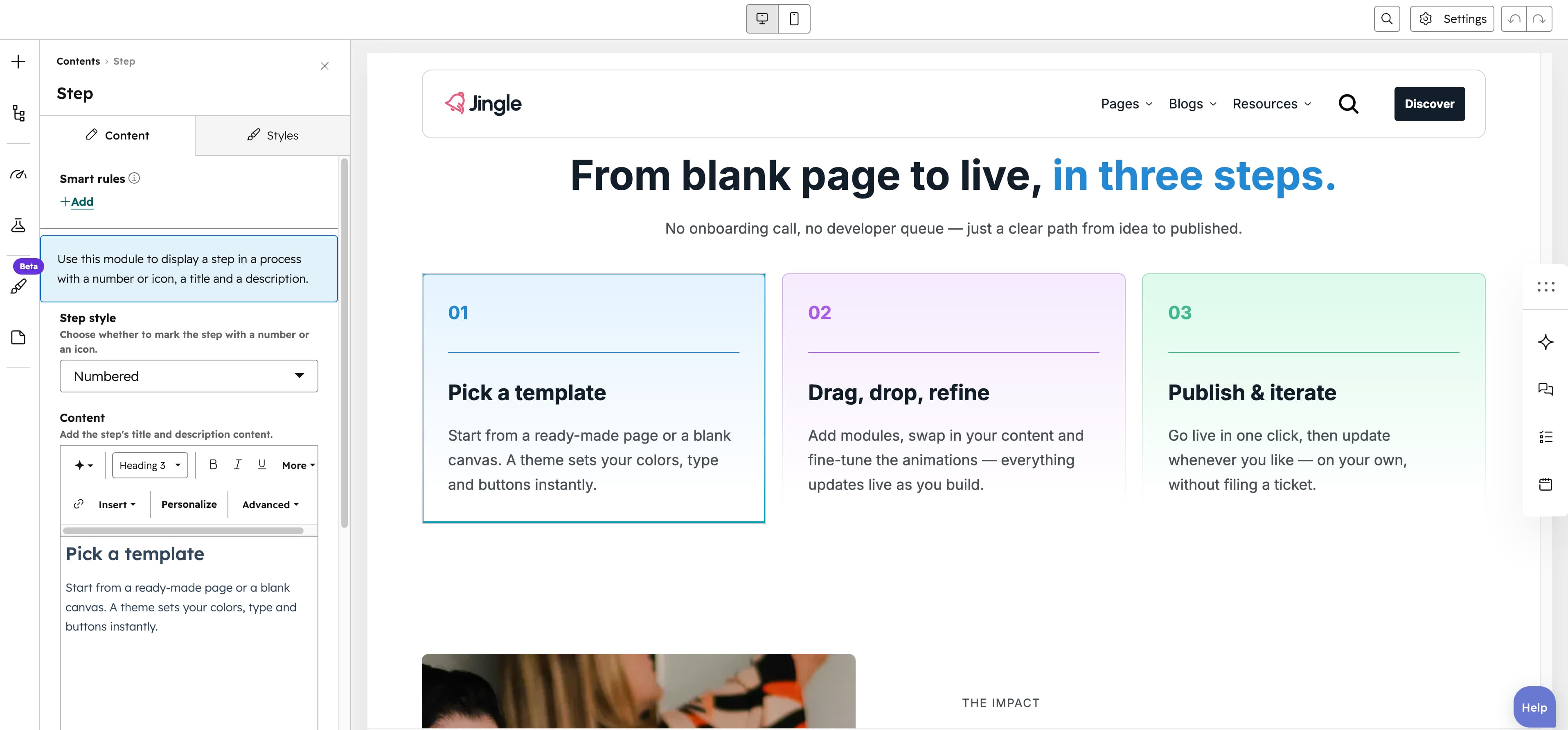
Step style
The Step style select chooses between Numbered (default) and Icon to mark the step with a number or an icon.
Icon
The Icon image field sets the icon shown for the step, with alt text for accessibility, and appears only when the Icon style is selected.
SRC set
The SRC set group, shown when the Icon style is selected, provides separate Tablet image and Mobile image uploads for better fit and performance on smaller screens.
Content
The Content rich-text field holds the step title and description together, defaulting to a Step title heading plus a short paragraph.
Step number
The Step number slider ranges from 1 to 100 in steps of 1 (default 1) and sets the number shown when the Numbered style is used.
Step theme
The Step theme select, shown when the Numbered style is used, applies the step indicators color: Default (default), First color, Second color, Third color, Fourth color, Fifth color or Gray color.
Reverse gradient
The Reverse gradient toggle, off by default, flips the direction of the step indicators gradient when enabled.
Text alignment
The Text alignment group sets text alignment for each screen size through the Mobile display, Tablet display and Desktop display selects, each offering Left, Center and Right (default Left).
Animation settings
The Animation settings group controls how the module animates into view. Animation type offers None (default), Fade in, Fade up, Fade down, Fade left, Fade right, Zoom in, Zoom out, Slide up, Slide down, Slide left and Slide right. Choosing any type other than None reveals Duration (0.1-3s, step 0.1, default 0.6s), Easing (Smooth (power1.out), Default (power2.out) [default], Snappy (power3.out), Very snappy (expo.out), Sine (sine.out), Overshoot (back.out), Springy (elastic.out), Bouncy (bounce.out) or Linear (none)) and Delay (0-5s, step 0.05, default 0s), while Travel distance (0-200px, step 5, default 30px) appears only for slide and directional fade animations.
Mobile order
The Mobile order slider ranges from -5 to 5 in steps of 1 and lets you shift the module up or down relative to sibling modules on mobile screens; lower numbers appear first.