
Team member
The Team member module presents an individual person as a card combining a photo, name, role, rich-text bio, social links and an optional call-to-action button. It is built for about or team pages and is typically repeated to introduce staff or contributors alongside their contact and social presence.
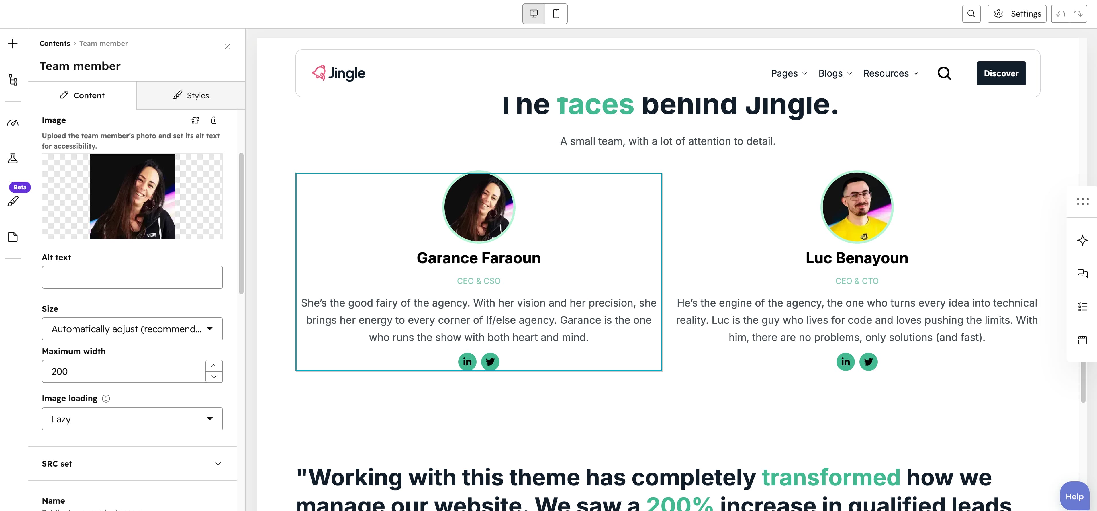
Image
The Image field sets the member photo; upload the file and set its alt text for accessibility.
SRC set
The SRC set group supplies smaller sources for smaller screens: a Tablet image and a Mobile image, each an image upload with its own alt text, used for better fit and performance on tablet and mobile.
Name
The Name text field sets the team members name (single-line text; defaults to John Doe).
Role
The Role text field sets the team members job title or role (single-line text).
Description
The Description field is a rich-text bio for the team member, supporting formatted text.
Social links
The Social links group is repeatable with no maximum (minimum 0, 2 created by default). Each entry pairs a Social icon chosen from the Font Awesome 6.4.2 set with a Social URL link that accepts external, content, file, email and blog targets, plus open-in-new-tab and no-follow options.
Show button
The Show button toggle is off by default; when enabled it reveals the Button group on the team member card.
Button
The Button group appears when Show button is on. Its Button type select — Button (default), Anchor or CTA — determines which settings show. Button settings (type Button) and Anchor settings (type Anchor) share Button text, a Show icon toggle (off by default) revealing an Icon image, a Button style select (Plain [default], Plain reversed, Outline, Text only, White, White reversed), the Button background color, Button background color (hover), Button border color, Button border color (hover), Button text color and Button text color (hover) pickers, and a Make button small toggle (off by default). Button settings also adds a Button URL link, while Anchor settings adds a Target field for the element to scroll to. Choosing type CTA instead shows CTA settings with a single CTA field.
Team member settings
The Team member settings group directly styles the card. Color pickers cover Title color, Role color, Description color, Background color, Border color, Image border color, Social media icons color and Social media icons background color; Background gradient and Border gradient add optional gradients (the border gradient needs a border width); and the Border width (0 to 20px, step 1), Border radius (0 to 200px, step 1) and Padding (0 to 200px, step 1) sliders control thickness, corner rounding and inner spacing.
Horizontal alignment
The Horizontal alignment group sets horizontal alignment per screen size through Mobile display, Tablet display and Desktop display selects; each offers Left (default), Center, Right, Space around, Space between and Stretch.
Text alignment
The Text alignment group sets text alignment per screen size through Mobile display, Tablet display and Desktop display selects; each offers Left (default), Center and Right.
Animation settings
The Animation settings group controls the scroll-into-view animation. Animation type chooses the entrance effect — None (default), Fade in, Fade up, Fade down, Fade left, Fade right, Zoom in, Zoom out, Slide up, Slide down, Slide left or Slide right. When a type other than None is chosen, Duration (0.1 to 3s, step 0.1, default 0.6s), Easing (Smooth (power1.out), Default (power2.out) [default], Snappy (power3.out), Very snappy (expo.out), Sine (sine.out), Overshoot (back.out), Springy (elastic.out), Bouncy (bounce.out) or Linear (none)) and Delay (0 to 5s, step 0.05, default 0s) appear, and Travel distance (0 to 200px, step 5, default 30px) is shown for slide and directional fade animations.
Mobile order
The Mobile order slider ranges from -5 to 5 (step 1); lower numbers appear first, letting you shift the module up or down relative to sibling modules on mobile screens.