
Blog tags
The Blog tags module displays a row of tag filter buttons for navigating a blog by topic, with an all articles option plus a button per selected tag. Each tag links to its tag archive page and the current tag is highlighted as active. Use it on blog listing or blog post pages to let visitors browse posts by category.
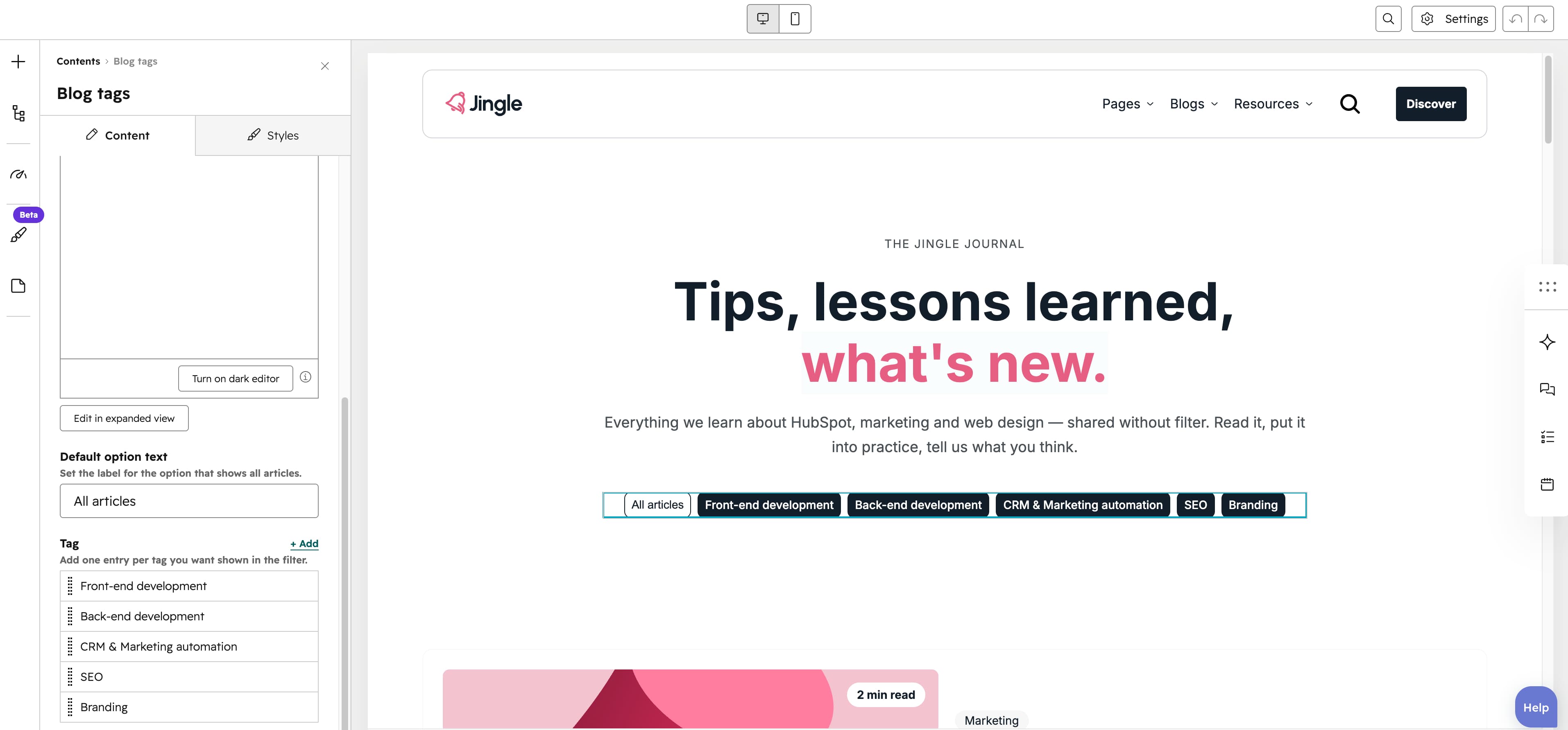
Description
An optional rich-text Description sets the heading shown above the tag filter buttons. It has no default value and accepts any formatted rich text, so leave it empty to hide it or fill it in to add an intro.
Default option text
The Default option text is a single-line text field (new lines disabled) that sets the label of the option showing all articles. It defaults to All articles and renders a button linking back to the full blog listing, marked active when no tag is selected.
Tag
The Tag field is a repeatable blog-tag picker with a minimum of 1 entry, no maximum and 3 entries created by default, letting you add as many tags as you want. Each entry becomes a button linking to that tags archive page under the blog URL, with the matching button highlighted active on its tag page.
Vertical alignment
The Vertical alignment group exposes distinct Mobile display, Tablet display and Desktop display selects so each screen size can differ. Every select offers Top, Center, Bottom, Space around, Space between and Stretch, and all three default to Top.
Horizontal alignment
The Horizontal alignment group exposes distinct Mobile display, Tablet display and Desktop display selects so each screen size can differ. Every select offers Left, Center, Right, Space around, Space between and Stretch, and all three default to Left.
Text alignment
The Text alignment group exposes distinct Mobile display, Tablet display and Desktop display selects so each screen size can differ. Every select offers Left, Center and Right, and all three default to Left.
Animation settings
The Animation settings group controls how the module animates into view. Animation type offers None (default, disables the animation), Fade in, Fade up, Fade down, Fade left, Fade right, Zoom in, Zoom out, Slide up, Slide down, Slide left and Slide right. When a type other than None is chosen, Duration (0.1s to 3s, step 0.1s, default 0.6s), Easing (Smooth (power1.out), Default (power2.out) — the default, Snappy (power3.out), Very snappy (expo.out), Sine (sine.out), Overshoot (back.out), Springy (elastic.out), Bouncy (bounce.out) and Linear (none)) and Delay (0s to 5s, step 0.05s, default 0s) appear. Travel distance (0px to 200px, step 5px, default 30px) is shown only for the slide and directional fade animations, staying hidden for None, Fade in, Zoom in and Zoom out.
Mobile order
The Mobile order slider runs from -5 to 5 in steps of 1 and lets you shift the module up or down relative to sibling modules on mobile screens; lower numbers appear first.