
Buttons
The Buttons module renders one or more call-to-action buttons from a repeatable Button group, so you can place a single CTA or a row of them. Each button can link to a URL or act as an on-page anchor, carry an optional icon, and be styled independently. Use it wherever you need standalone action links that are not tied to a card or feature block.
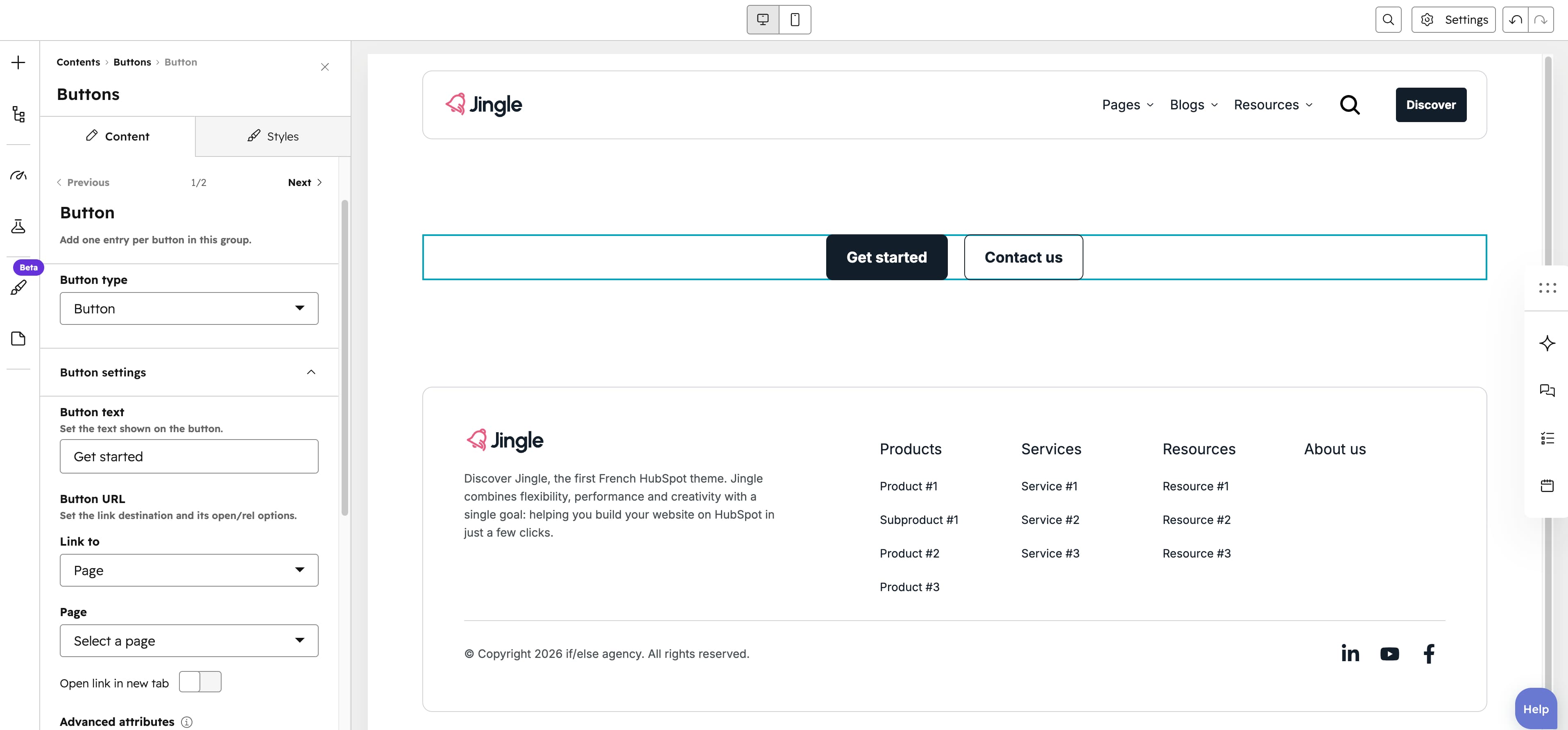
Button
The Button group is repeatable (minimum 1, 1 created by default, no maximum). Each entry starts with a Button type and then exposes the settings that match that type, letting you place a single call to action or a whole row of them.
Button type
The Button type select offers Button (default), Anchor and CTA. Button exposes Button settings with a Button URL link (external, content, file, email address or blog); Anchor exposes Anchor settings with a Target that scrolls to a #id or .class element on the page; CTA exposes CTA settings with a HubSpot CTA field.
Show icon
The Show icon toggle is off by default. When on, it reveals an Icon image field (with alt text) so each button can display an icon alongside its text.
Button style
Each button has a Button style select offering Plain (default), Plain reversed, Outline, Text only, White and White reversed. For the Outline and Text only styles a Button theme select appears with Default (default), First color, Second color, Third color, Fourth color, Fifth color and Gray color. A Make button small toggle (off by default) renders the button at a smaller size.
Vertical alignment
The Vertical alignment group positions the button row vertically through separate Mobile display, Tablet display and Desktop display selects, each offering Top (default), Center, Bottom, Space around, Space between and Stretch.
Horizontal alignment
The Horizontal alignment group positions the button row horizontally through separate Mobile display, Tablet display and Desktop display selects, each offering Left (default), Center, Right, Space around, Space between and Stretch.
Text alignment
The Text alignment group sets how the button text aligns through separate Mobile display, Tablet display and Desktop display selects, each offering Left (default), Center and Right.
Animation settings
The Animation settings group animates the module as it scrolls into view. Animation type offers None (default), Fade in, Fade up, Fade down, Fade left, Fade right, Zoom in, Zoom out, Slide up, Slide down, Slide left and Slide right. When an animation is active it reveals Duration (0.1 to 3s, step 0.1, default 0.6s), Easing (Smooth (power1.out), Default (power2.out) as the default, Snappy (power3.out), Very snappy (expo.out), Sine (sine.out), Overshoot (back.out), Springy (elastic.out), Bouncy (bounce.out) or Linear (none)), Delay (0 to 5s, step 0.05, default 0s) and Travel distance (0 to 200px, step 5, default 30px, shown for slide and directional-fade animations).
Mobile order
The Mobile order slider (min -5, max 5, step 1) shifts the module up or down relative to sibling modules on mobile screens; lower numbers appear first.