
Testimonials carousel
The Testimonials carousel module displays a slider of customer testimonials, each combining a rich-text quote, an author image, author name and role, and a star rating. Navigation arrows and dots are shown by default, and the carousel offers the same behavior controls as the other carousels. Use it for social proof sections that rotate through multiple reviews.
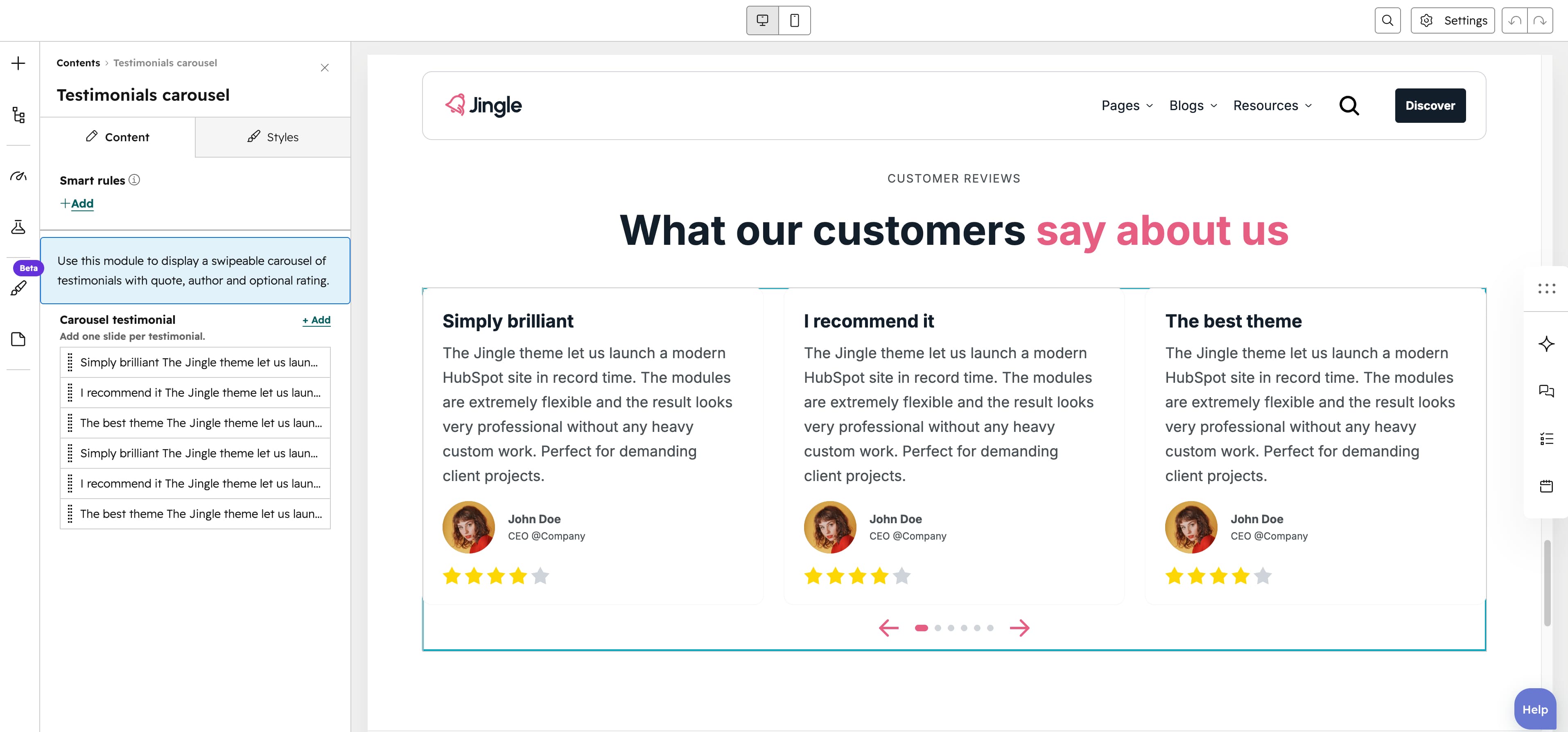
Carousel testimonial
The Carousel testimonial group is repeatable (minimum 1, 6 created by default, no maximum). Each slide has a rich-text Description quote, an Author image with a SRC set (Tablet image and Mobile image), an Author name, an Author role and a Rating.
Rating
The Rating number field (1 to 5, step 1, default 4) renders that many filled stars while the remainder are shown dimmed.
Carousel behavior
The Carousel behavior group controls playback and transitions. Enable autoplay (off by default) reveals Autoplay duration (0 to 120 seconds, default 10). Animation duration sets the transition speed (0 to 12000 milliseconds, step 100, default 300). Loop carousel slides (on by default) loops back to the first slide, while Center carousel slides and Center carousel insufficient slides (both off by default) control centering. Carousel slides transition offers Slide (default) or Coverflow.
Number of visible items
The Number of visible items group sets how many slides show at once through Mobile display (default 1), Tablet display (default 2) and Desktop display (default 3) sliders, each ranging 1 to 12 (step 1).
Space between slides
The Space between slides group sets the gap between slides through Mobile display, Tablet display and Desktop display sliders, each 0 to 150px (step 4, default 20).
Show dots
The Show dots group toggles the pagination dots per breakpoint through Mobile display, Tablet display and Desktop display toggles, all on by default.
Show arrows
The Show arrows group toggles the navigation arrows per breakpoint through Mobile display, Tablet display and Desktop display toggles, all on by default.
Vertical alignment
The Vertical alignment group controls vertical positioning through separate Mobile display, Tablet display and Desktop display selects, each offering Top (default), Center, Bottom, Space around, Space between and Stretch.
Horizontal alignment
The Horizontal alignment group controls horizontal positioning through separate Mobile display, Tablet display and Desktop display selects, each offering Left (default), Center, Right, Space around, Space between and Stretch.
Text alignment
The Text alignment group controls text alignment through separate Mobile display, Tablet display and Desktop display selects, each offering Left (default), Center and Right.
Carousel theme
The Carousel theme select applies an overall color scheme with First (default), Second, Third, Fourth, Fifth, Gray or None.
Animation settings
The Animation settings group animates the module as it scrolls into view. Animation type offers None (default), Fade in, Fade up, Fade down, Fade left, Fade right, Zoom in, Zoom out, Slide up, Slide down, Slide left and Slide right. When an animation is active it reveals Duration (0.1 to 3s, step 0.1, default 0.6s), Easing (Smooth (power1.out), Default (power2.out) as the default, Snappy (power3.out), Very snappy (expo.out), Sine (sine.out), Overshoot (back.out), Springy (elastic.out), Bouncy (bounce.out) or Linear (none)), Delay (0 to 5s, step 0.05, default 0s) and Travel distance (0 to 200px, step 5, default 30px, shown for slide and directional-fade animations).
Mobile order
The Mobile order slider (min -5, max 5, step 1) shifts the module up or down relative to sibling modules on mobile screens; lower numbers appear first.