
Blog listing body
The Blog listing body module renders the list of blog posts on a blog listing page, displaying each post with its featured image, title, metadata, summary and a link button. It controls how posts are laid out and which post details are shown. Use it as the main post grid or list on a blog listing template.
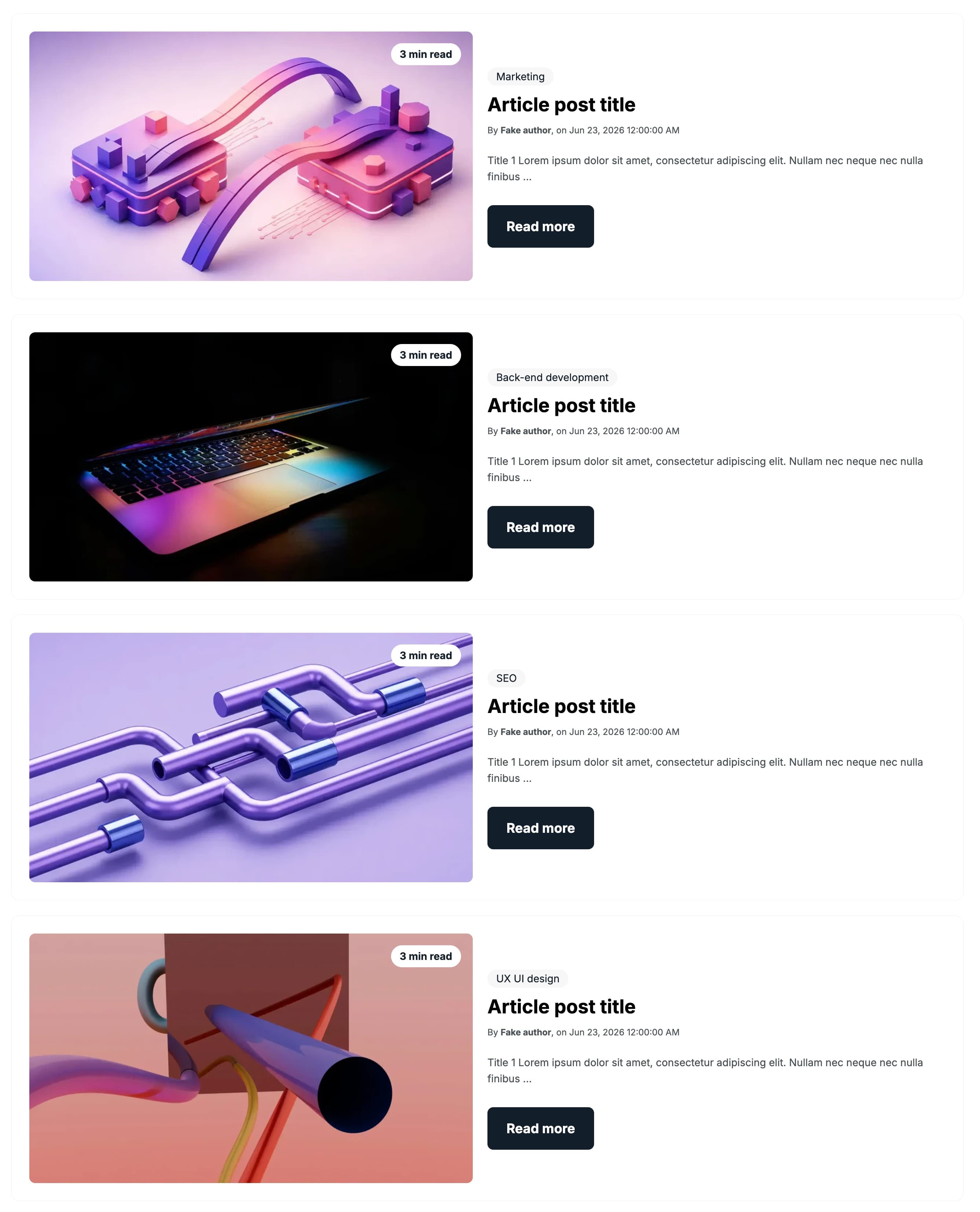
Blog posts design
The Blog posts design select chooses the layout used for each post, with three options: Card (the default), Row and Simple. For the Card and Simple layouts a Blog posts per row value (1-4, default 3) sets how many posts appear per row; that control is hidden when Row is selected.
Blog posts per row
The Blog posts per row number sets how many posts appear side by side in each row, from a minimum of 1 to a maximum of 4 in steps of 1 (default 3). It applies to the Card and Simple layouts and is hidden when the Row layout is selected.
Fallback image
The Fallback image is an uploadable image used for any post that has no featured image, so cards always show an illustration; it starts empty and supports alt text for accessibility.
Show date
The Show date toggle controls whether the publish date is shown on each post. It is on by default; turn it off to hide the date entirely. When on, the Date text label is displayed before the date.
Date text
The Date text is a single-line text field that sets the label shown before the publish date (default on). It is visible only when Show date is turned on.
Show author
The Show author toggle controls whether the author is shown on each post. It is on by default; turn it off to hide the author. When on, the Author text label is displayed before the author name.
Author text
The Author text is a single-line text field that sets the label shown before the author name (default Written by). It is visible only when Show author is turned on.
Show tags
The Show tags toggle controls whether each posts tags are shown. It is on by default; turn it off to hide the tags.
Show read time
The Show read time toggle controls whether the estimated reading time is shown on each post. It is on by default; turn it off to hide the read time. When on, the Read time text label is displayed.
Read time text
The Read time text is a single-line text field that sets the read-time label; use the [time] placeholder for the number of minutes (default [time] min read). It is visible only when Show read time is turned on.
Button
The Button group configures the link shown on each post, which points to that posts URL. Button style is a select with six options: Plain (the default), Plain reversed, Outline, Text only, White and White reversed. Button text sets the button label (default Discover). Show icon is a toggle, off by default, that reveals an Icon image field (with alt text) shown next to the text. Make button small is a toggle, off by default, that renders the button at a smaller size.
Vertical alignment
The Vertical alignment group sets how content aligns vertically, with separate Mobile display, Tablet display and Desktop display selects. Each offers the same six options: Top (the default), Center, Bottom, Space around, Space between and Stretch.
Horizontal alignment
The Horizontal alignment group sets how content aligns horizontally, with separate Mobile display, Tablet display and Desktop display selects. Each offers the same six options: Left (the default), Center, Right, Space around, Space between and Stretch.
Text alignment
The Text alignment group sets how text aligns, with separate Mobile display, Tablet display and Desktop display selects. Each offers three options: Left (the default), Center and Right.
Animation settings
The Animation settings group controls how the module animates as it scrolls into view. Animation type is a select with twelve options: None (the default, which disables the animation), Fade in, Fade up, Fade down, Fade left, Fade right, Zoom in, Zoom out, Slide up, Slide down, Slide left and Slide right. When a type other than None is chosen, four more controls appear: Duration (slider 0.1 to 3s, step 0.1, default 0.6s), Easing (select with Smooth (power1.out), Default (power2.out) as the default, Snappy (power3.out), Very snappy (expo.out), Sine (sine.out), Overshoot (back.out), Springy (elastic.out), Bouncy (bounce.out) and Linear (none)) and Delay (slider 0 to 5s, step 0.05, default 0s). Travel distance (slider 0 to 200px, step 5, default 30px) appears only for the directional slide and fade animations, and stays hidden for None, Fade in, Zoom in and Zoom out.
Mobile order
The Mobile order slider reorders this column on mobile, from -5 to 5 in steps of 1, where lower numbers appear first relative to sibling modules.