
Custom rich text
The Custom rich text module is a simple content block for placing freely formatted text on a page, with full control over how it displays across screen resolutions. It is the go-to module for paragraphs, headings, and inline formatting that need responsive alignment and typography control, so use it anywhere you need editable body copy.
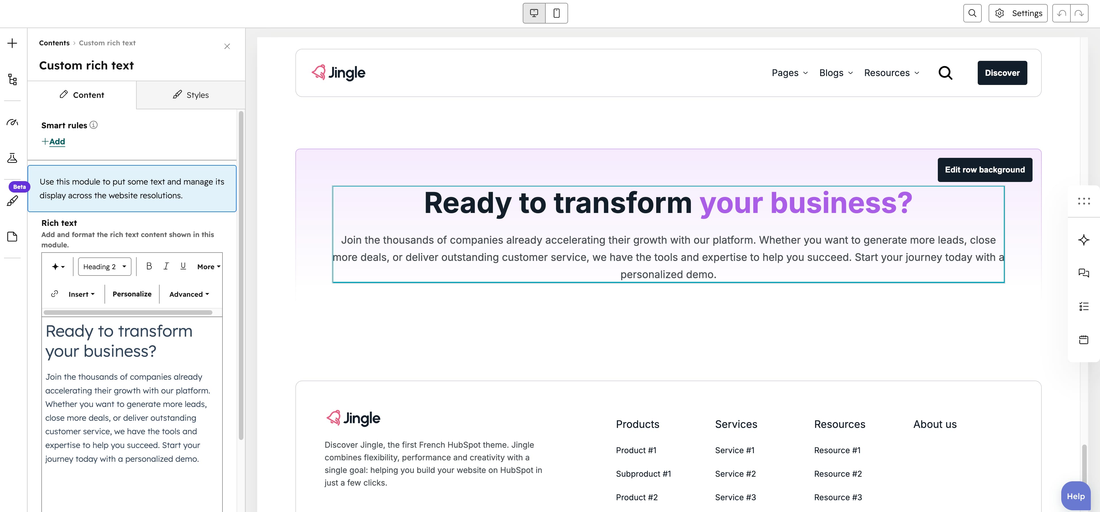
Rich text
The Rich text field is a full rich-text editor holding all formatted content for the module — paragraphs, headings and inline formatting — and ships with sample placeholder content by default.
Vertical alignment
The Vertical alignment group sets vertical alignment for each screen size through the Mobile display, Tablet display and Desktop display selects, each offering Top, Center, Bottom, Space around, Space between and Stretch (default Top).
Horizontal alignment
The Horizontal alignment group sets horizontal alignment for each screen size through the Mobile display, Tablet display and Desktop display selects, each offering Left, Center, Right, Space around, Space between and Stretch (default Left).
Text alignment
The Text alignment group sets text alignment for each screen size through the Mobile display, Tablet display and Desktop display selects, each offering Left, Center and Right (default Left).
Typography settings
The Typography settings group remaps each heading and text style — H1 display through H6 display, Body display and Pre display — with independent Mobile display, Tablet display and Desktop display selects. Each select offers Default (default), Display, the heading levels H1-H6, Body, Pre, Small and Extra-small, letting any style borrow another styles typography per screen size.
Animation settings
The Animation settings group controls how the module animates into view. Animation type offers None (default), Fade in, Fade up, Fade down, Fade left, Fade right, Zoom in, Zoom out, Slide up, Slide down, Slide left and Slide right. Choosing any type other than None reveals Duration (0.1-3s, step 0.1, default 0.6s), Easing (Smooth (power1.out), Default (power2.out) [default], Snappy (power3.out), Very snappy (expo.out), Sine (sine.out), Overshoot (back.out), Springy (elastic.out), Bouncy (bounce.out) or Linear (none)) and Delay (0-5s, step 0.05, default 0s), while Travel distance (0-200px, step 5, default 30px) appears only for slide and directional fade animations.
Mobile order
The Mobile order slider ranges from -5 to 5 in steps of 1 and lets you shift the module up or down relative to sibling modules on mobile screens; lower numbers appear first.