
Testimonial
The Testimonial module presents a customer quote together with the authors name, role and avatar photo. It is designed to add social proof to landing and site pages. Use it to feature an individual client or customer endorsement.
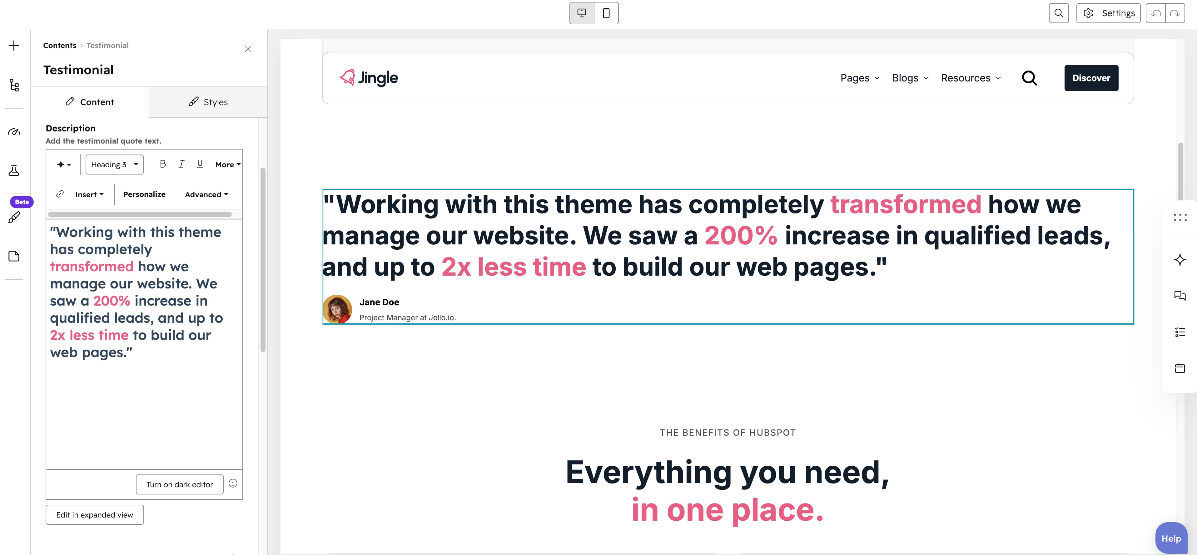
Description
The Description rich-text field holds the testimonial quote text and supports formatting.
Author avatar
The Author avatar image field renders the authors photo; upload it and set its alt text for accessibility.
SRC set
The SRC set group provides smaller Tablet image and Mobile image variants of the avatar, each with its own alt text, for better fit and performance on smaller screens.
Author name
The Author name text field labels who gave the testimonial (single-line text; defaults to John Doe).
Author role
The Author role text field sets the authors job title and company (single-line text).
Testimonial settings
The Testimonial settings group directly styles the testimonial. Author name color, Author role color, Quote color, Background color and Border color are color pickers; Background gradient and Border gradient add optional gradients (the border gradient needs a border width); and the Border width (0 to 20px, step 1), Border radius (0 to 200px, step 1) and Padding (0 to 200px, step 1) sliders set thickness, corner rounding and inner spacing.
Vertical alignment
The Vertical alignment group sets vertical alignment per screen size through Mobile display, Tablet display and Desktop display selects; each offers Top (default), Center, Bottom, Space around, Space between and Stretch.
Horizontal alignment
The Horizontal alignment group sets horizontal alignment per screen size through Mobile display, Tablet display and Desktop display selects; each offers Left (default), Center, Right, Space around, Space between and Stretch.
Text alignment
The Text alignment group sets text alignment per screen size through Mobile display, Tablet display and Desktop display selects; each offers Left (default), Center and Right.
Animation settings
The Animation settings group controls the scroll-into-view animation. Animation type chooses the entrance effect — None (default), Fade in, Fade up, Fade down, Fade left, Fade right, Zoom in, Zoom out, Slide up, Slide down, Slide left or Slide right. When a type other than None is chosen, Duration (0.1 to 3s, step 0.1, default 0.6s), Easing (Smooth (power1.out), Default (power2.out) [default], Snappy (power3.out), Very snappy (expo.out), Sine (sine.out), Overshoot (back.out), Springy (elastic.out), Bouncy (bounce.out) or Linear (none)) and Delay (0 to 5s, step 0.05, default 0s) appear, and Travel distance (0 to 200px, step 5, default 30px) is shown for slide and directional fade animations.
Mobile order
The Mobile order slider ranges from -5 to 5 (step 1); lower numbers appear first, letting you shift the module up or down relative to sibling modules on mobile screens.