
Image
The Image module displays a single image with responsive sizing, decorative options and an optional caption. The main image is paired with a separate set of tablet and mobile sources, making it well suited whenever you need a styled, optionally credited image inside a row, or want lighter sources served to smaller screens for performance.
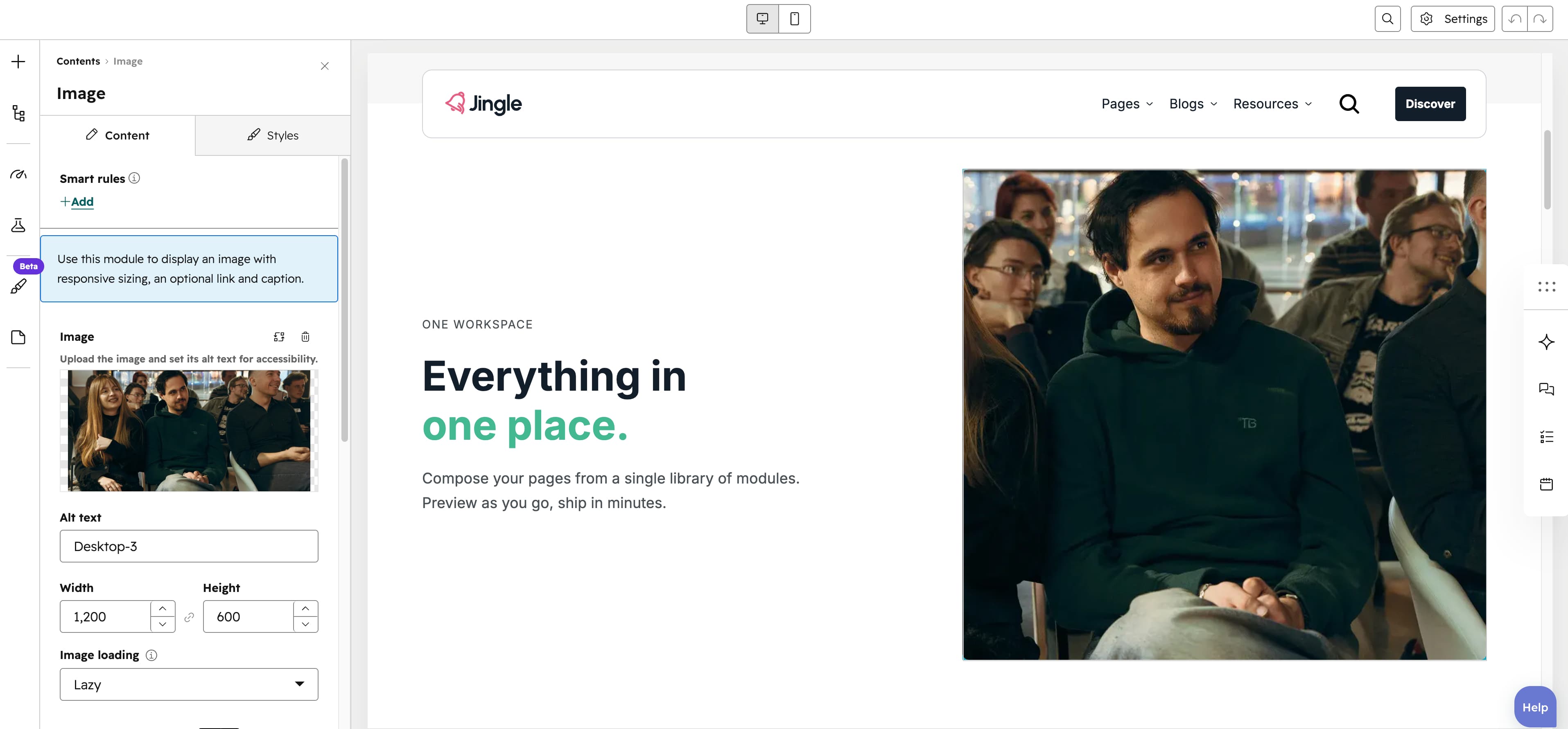
Image
The Image field sets the main image displayed by the module; upload it and set its alt text for accessibility.
Make image full width
The Make image full width toggle (on by default) makes the image ignore its own dimensions and stretch to fill its containers full width; turn it off to keep the images natural width.
Make image full height
The Make image full height toggle (on by default) makes the image ignore its own dimensions and stretch to fill its containers full height; turn it off to keep the images natural height.
Image fit
The Image fit select controls how the image fills its box: Cover crops the image to fill the space, while Contain fits the whole image inside it.
Add border radius
The Add border radius toggle (on by default) rounds the image corners; turn it off for square corners.
Add grayscale filter
The Add grayscale filter toggle (off by default) renders the image in grayscale when enabled.
Add legend
The Add legend toggle (off by default) reveals the Legend field, a small caption shown in the bottom-right corner of the image.
Legend
The Legend rich-text field, shown only when Add legend is on, holds a short caption such as an artist credit or brief description.
Preload image
The Preload image toggle (off by default) marks the image as high priority to speed up loading of a key above-the-fold image.
SRC set
The SRC set group lets you supply a dedicated Tablet image and Mobile image, each with alt text, useful when the desktop image is too large for smaller layouts or for performance.
Vertical alignment
The Vertical alignment group sets vertical alignment per screen size through Mobile display, Tablet display and Desktop display selects; each offers Top (default), Center, Bottom, Space around, Space between and Stretch.
Horizontal alignment
The Horizontal alignment group sets horizontal alignment per screen size through Mobile display, Tablet display and Desktop display selects; each offers Left (default), Center, Right, Space around, Space between and Stretch.
Text alignment
The Text alignment group sets text alignment per screen size through Mobile display, Tablet display and Desktop display selects; each offers Left (default), Center and Right.
Animation settings
The Animation settings group controls the scroll-into-view animation. Animation type chooses the entrance effect — None (default), Fade in, Fade up, Fade down, Fade left, Fade right, Zoom in, Zoom out, Slide up, Slide down, Slide left or Slide right. When a type other than None is chosen, Duration (0.1 to 3s, step 0.1, default 0.6s), Easing (Smooth (power1.out), Default (power2.out) [default], Snappy (power3.out), Very snappy (expo.out), Sine (sine.out), Overshoot (back.out), Springy (elastic.out), Bouncy (bounce.out) or Linear (none)) and Delay (0 to 5s, step 0.05, default 0s) appear, and Travel distance (0 to 200px, step 5, default 30px) is shown for slide and directional fade animations.
Mobile order
The Mobile order slider ranges from -5 to 5 (step 1); lower numbers appear first, letting you shift the module up or down relative to sibling modules on mobile screens.