
Accordion
The Accordion module displays a repeatable list of collapsible items, each combining a Title and a rich-text Description, making it well suited to FAQs and other expand-on-click content. You add as many items as needed and visitors toggle them open to reveal the answer, condensing long-form Q&A or explanatory text into a compact, scannable block.
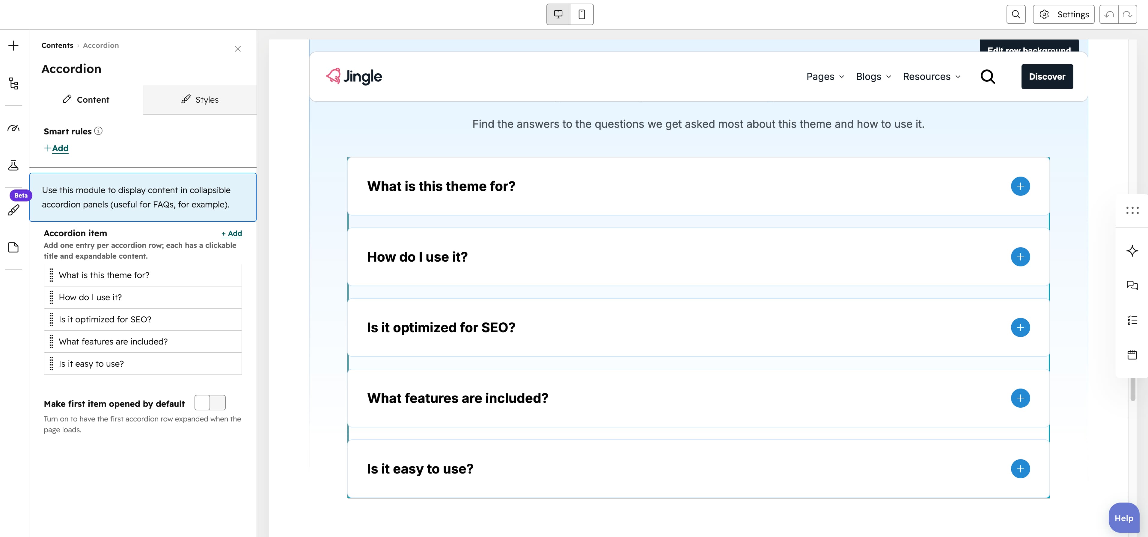
Accordion item
The Accordion item group is repeatable (minimum 1, 4 created by default, no maximum).
Each entry combines a Title text field, which is the clickable row heading, and a Description rich-text field, which holds the content revealed when the row is opened.
Make first item opened by default
The Make first item opened by default toggle is off by default. When on, the first accordion entry starts expanded on page load; when off, every entry starts collapsed.
Vertical alignment
The Vertical alignment group controls vertical positioning through separate Mobile display, Tablet display and Desktop display selects, each offering Top (default), Center, Bottom, Space around, Space between and Stretch.
Horizontal alignment
The Horizontal alignment group controls horizontal positioning through separate Mobile display, Tablet display and Desktop display selects, each offering Left (default), Center, Right, Space around, Space between and Stretch.
Text alignment
The Text alignment group controls text alignment through separate Mobile display, Tablet display and Desktop display selects, each offering Left (default), Center and Right.
Accordion theme
The Accordion theme select styles the accordion blocks with First color (default), Second color, Third color, Fourth color, Fifth color, Gray color, White color or None.
Animation settings
The Animation settings group animates the module as it scrolls into view. Animation type offers None (default), Fade in, Fade up, Fade down, Fade left, Fade right, Zoom in, Zoom out, Slide up, Slide down, Slide left and Slide right. When an animation is active it reveals Duration (0.1 to 3s, step 0.1, default 0.6s), Easing (Smooth (power1.out), Default (power2.out) as the default, Snappy (power3.out), Very snappy (expo.out), Sine (sine.out), Overshoot (back.out), Springy (elastic.out), Bouncy (bounce.out) or Linear (none)), Delay (0 to 5s, step 0.05, default 0s) and Travel distance (0 to 200px, step 5, default 30px, shown for slide and directional-fade animations).
Mobile order
The Mobile order slider (min -5, max 5, step 1) shifts the module up or down relative to sibling modules on mobile screens; lower numbers appear first.