
Language switcher
The Language switcher module renders a compact dropdown listing the published translated variants of the current page, with the active language shown as the top-level item and each entry labelled by its two-letter locale code. It hides automatically on system templates (error, password, membership, unsubscribe, subscription, search) and only appears when translated content exists, unless forced. Use it on multilingual sites to let visitors switch language.
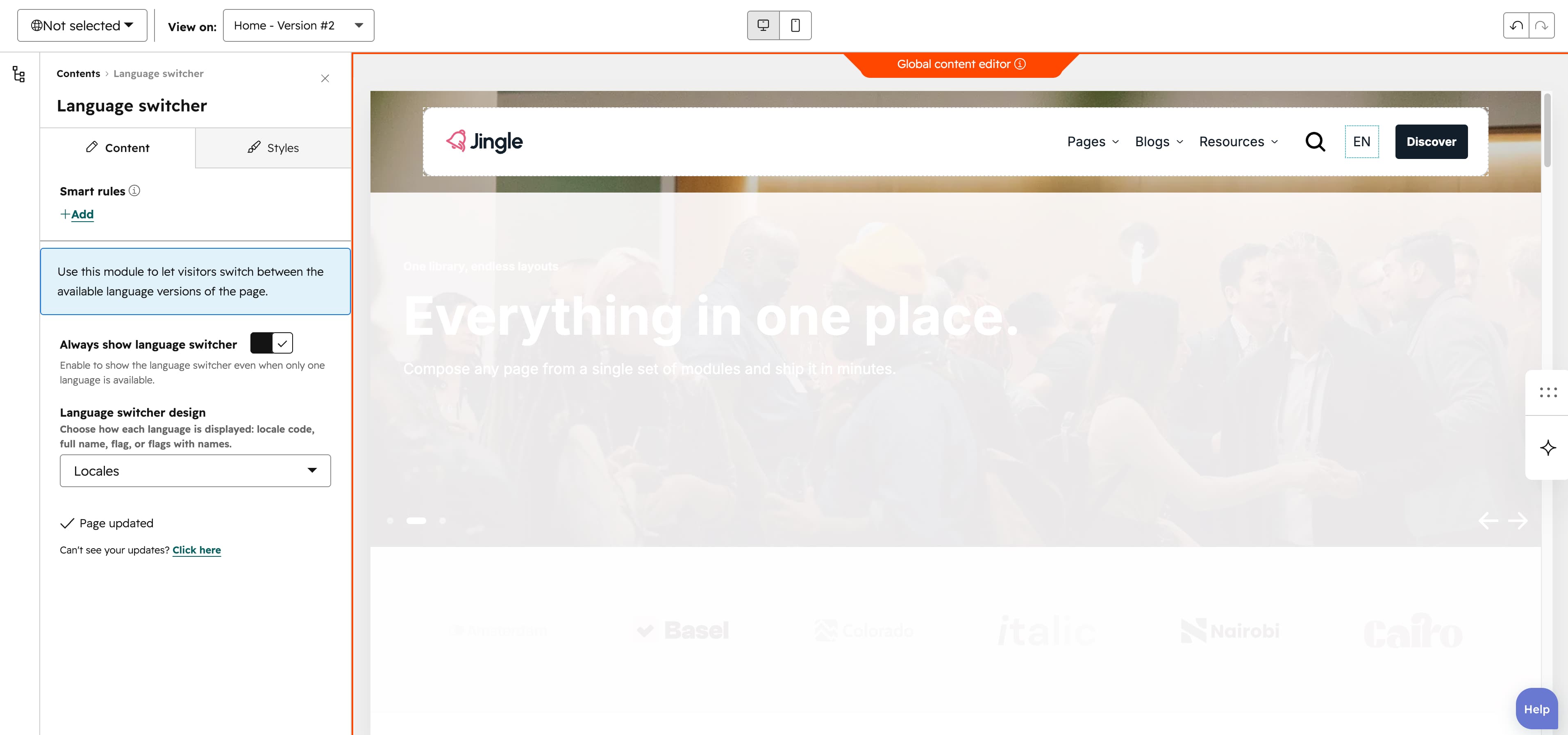
Always show language switcher
The Always show language switcher toggle (off by default) controls when the switcher renders. When on, it forces the switcher to show even when only one language is available or no translated content exists; when off, it appears only where translated content exists or in the previewer.
Language switcher design
The Language switcher design select controls how each language is displayed and offers four options: Locales (the two-letter locale code, the default), Full names (the full language name), Flags (a flag icon only) and Flags and names (flag plus name).
Vertical alignment
The Vertical alignment group sets how the module aligns vertically at each breakpoint through three selects — Mobile display, Tablet display and Desktop display. Each offers Top (the default), Center, Bottom, Space around, Space between and Stretch.
Horizontal alignment
The Horizontal alignment group sets the horizontal alignment per breakpoint through Mobile display, Tablet display and Desktop display selects. Each offers Left (the default), Center, Right, Space around, Space between and Stretch.
Text alignment
The Text alignment group aligns the text per breakpoint through Mobile display, Tablet display and Desktop display selects, each offering Left (the default), Center and Right.
Animation settings
The Animation settings group controls the scroll-into-view entrance. Animation type selects the effect — None (the default), Fade in, Fade up, Fade down, Fade left, Fade right, Zoom in, Zoom out, Slide up, Slide down, Slide left or Slide right. When a type other than None is chosen, Duration (0.1–3s, step 0.1, default 0.6s), Easing (Smooth (power1.out), Default (power2.out) the default, Snappy (power3.out), Very snappy (expo.out), Sine (sine.out), Overshoot (back.out), Springy (elastic.out), Bouncy (bounce.out) or Linear (none)) and Delay (0–5s, step 0.05, default 0s) appear. Travel distance (0–200px, step 5, default 30px) additionally appears for slide and directional-fade animations, and stays hidden for None, Fade in, Zoom in and Zoom out.