
Custom form
The Custom form module embeds a HubSpot form and styles it to match the theme, rendering it through the HubL form tag. It exposes the standard HubSpot form configuration plus options to override notification recipients and attach a Salesforce campaign. Use it anywhere you need a themed lead-capture or contact form.
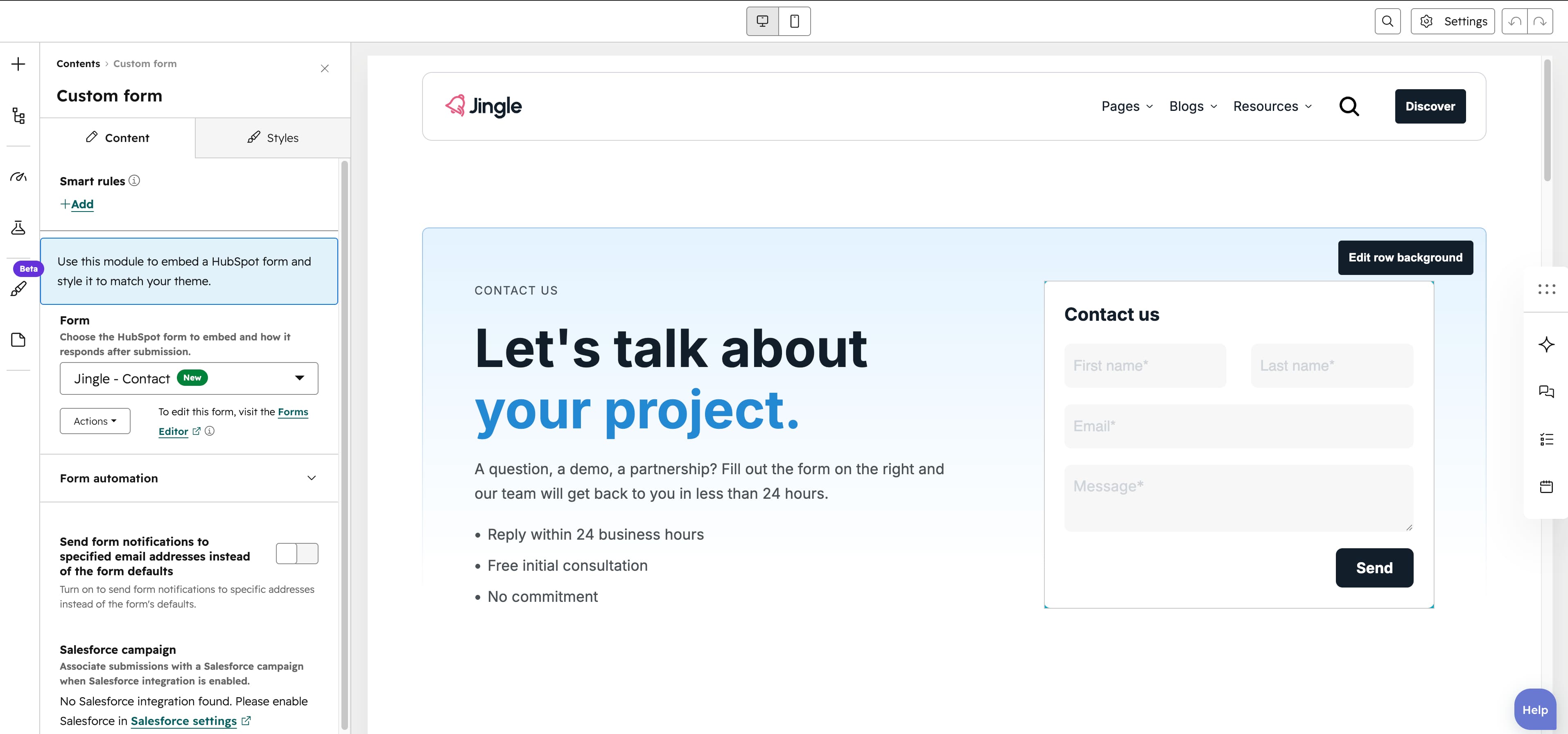
Form
The Form field selects the HubSpot form to embed (embed versions v2 and v4) and carries its response type (such as inline), success message and any redirect settings.
Send form notifications to specified email addresses instead of the form defaults
The Send form notifications to specified email addresses instead of the form defaults toggle (default off) overrides the forms default notification recipients; it is hidden when the selected form is a ticket form.
Email Addresses
The Email Addresses field, shown only when the override toggle is on, lists the recipients that receive this forms submission notifications.
Salesforce campaign
The Salesforce campaign field associates submissions with a Salesforce campaign when the Salesforce integration is enabled.
Vertical alignment
The Vertical alignment group sets vertical positioning through its Mobile display, Tablet display and Desktop display selects, each offering Top, Center, Bottom, Space around, Space between or Stretch (default Top).
Horizontal alignment
The Horizontal alignment group sets horizontal positioning through its Mobile display, Tablet display and Desktop display selects, each offering Left, Center, Right, Space around, Space between or Stretch (default Left).
Text alignment
The Text alignment group sets text alignment through its Mobile display, Tablet display and Desktop display selects, each offering Left, Center or Right (default Left).
Form theme
The Form theme select applies Default (default), First color, Second color, Third color, Fourth color, Fifth color or Gray color to the embedded form.
Animation settings
The Animation settings group controls the scroll-into-view animation. Animation type offers None (default), Fade in, Fade up, Fade down, Fade left, Fade right, Zoom in, Zoom out, Slide up, Slide down, Slide left or Slide right; when it is not None, Duration (0.1–3s, step 0.1, default 0.6s), Easing (Smooth (power1.out), Default (power2.out), Snappy (power3.out), Very snappy (expo.out), Sine (sine.out), Overshoot (back.out), Springy (elastic.out), Bouncy (bounce.out) or Linear (none); default Default (power2.out)), Delay (0–5s, step 0.05, default 0s) and, for slide and directional-fade types, Travel distance (0–200px, step 5, default 30px) appear.
Mobile order
The Mobile order slider (-5 to 5, in steps of 1) shifts this module earlier or later than its siblings on mobile; lower numbers appear first.