
Pricing card
The Pricing card module presents a single pricing plan with a title, a price and billing period, a description, a repeatable list of included features and a call-to-action button. It is built for pricing pages and plan comparisons, and supports a highlighted variant to emphasize a recommended plan. Use it to lay out one tier of a pricing table.
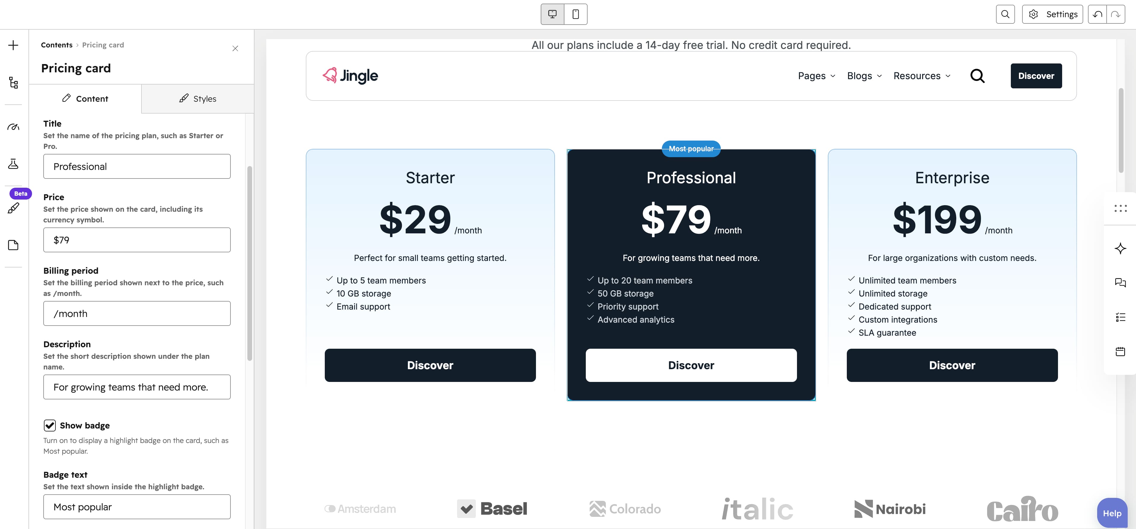
Title
The Title text field sets the name of the pricing plan, such as Starter or Pro (default Starter).
Price
The Price text field sets the price shown on the card, including its currency symbol (default $29).
Billing period
The Billing period text field sets the billing period shown next to the price, such as /month (default /month).
Description
The Description text field sets the short description shown under the plan name (default Perfect for small teams getting started.).
Show badge
The Show badge checkbox, off by default, displays a highlight badge on the card when enabled (for example to mark a plan as popular or recommended) and reveals the Badge text field.
Badge text
The Badge text field sets the text shown inside the highlight badge (default Most popular) and appears only when Show badge is enabled.
Features
The Features group is repeatable with a minimum of 1 entry and no maximum (3 created by default). Each entry holds a Feature text line (default Feature included) that builds the list of what the plan includes.
Show button
The Show button toggle, on by default, displays a call-to-action button on the card; turning it off hides the Button group.
Button
The Button group appears when Show button is on. Button type selects Button (default), Anchor or CTA, revealing the matching settings. Button and Anchor settings share Button text (default Discover), Show icon (off by default) which reveals an Icon image, a Button style (Plain [default], Plain reversed, Outline, Text only, White, White reversed), a Button theme shown for the Outline and Text only styles (Default [default], First color, Second color, Third color, Fourth color, Fifth color, Gray color) and a Make button small toggle (off by default); Button uses a Button URL link while Anchor uses a Target field, and the CTA type instead exposes a CTA field.
Pricing style
The Pricing style select chooses between Default (default) and Highlighted to visually emphasize a featured tier.
Horizontal alignment
The Horizontal alignment group (Left/Center/Right) exposes distinct Mobile display, Tablet display and Desktop display values.
Text alignment
The Text alignment group (Left/Center/Right) exposes distinct Mobile display, Tablet display and Desktop display values.
Pricing card theme
The Pricing card theme select applies Default or one of the theme colors (First color through Fifth color and Gray color) to style the card.
Pricing card text theme
The Pricing card text theme select applies Default, White or Black text colors to the card.
Reverse gradient
The Reverse gradient toggle flips the direction of the cards gradient.
Animation settings
The Animation settings group sets how the module animates into view, with an Animation type (fade, zoom, slide variants), Duration, Easing, Delay and Travel distance.
Mobile order
The Mobile order slider (-5 to 5) lets you shift the module up or down relative to sibling modules on mobile screens.