
Blog post hero
The Blog post hero module displays the header of a single blog post, including the title, optional tags, author, publish date, breadcrumb, and the featured image. It supports several layout styles and is intended for blog post pages only. Use it at the top of a blog post template, above the post body.
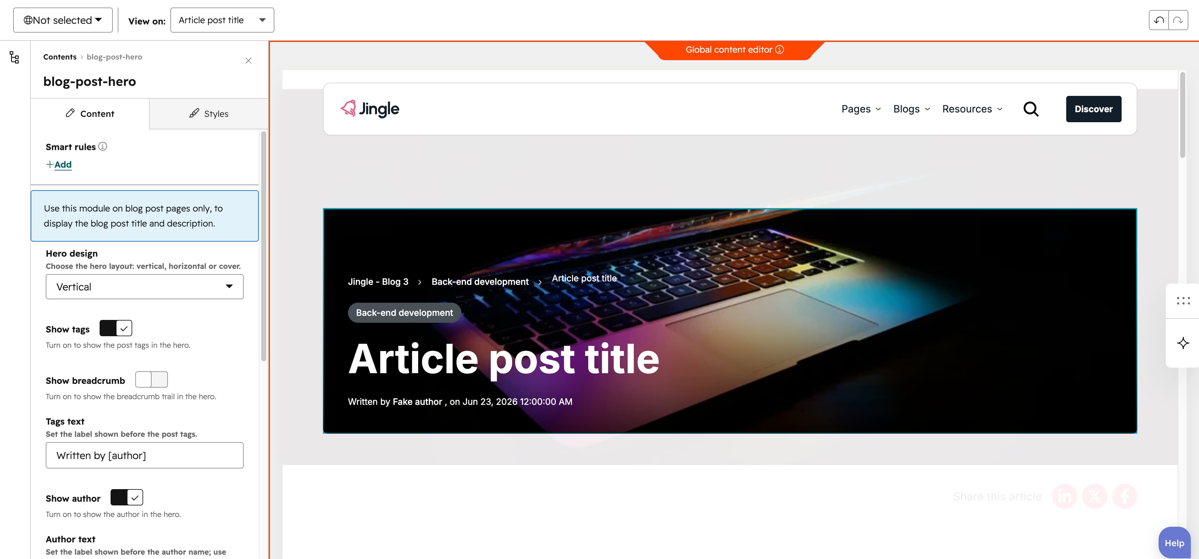
Hero design
The Hero design select offers three layouts that change how the text block and featured image are arranged: Vertical (the default), Horizontal, and Cover.
Show tags
Show tags is a toggle, on by default. When on, the posts topics are rendered as links to their tag pages and the Tags text field becomes available; when off, the tags and their label are hidden.
Show breadcrumb
Show breadcrumb is a toggle, off by default. When on, a breadcrumb trail is added above the hero listing the blog name, the posts first topic and the post title as navigable links; when off, no breadcrumb is shown.
Tags text
Tags text is a text field (default Written by [author]) that sets the label shown before the post tags; it only appears when Show tags is on.
Show author
Show author is a toggle, on by default. When on, the author byline is rendered and the Author text field becomes available; when off, the author is hidden.
Author text
Author text is a text field (default Written by [author]) that sets the label shown before the author name, using the [author] placeholder for the linked author name; it appears only when Show author is on.
Show date
Show date is a toggle, on by default. When on, the publish date is shown in the hero byline and the Date text field becomes available; when off, the date is hidden.
Date text
Date text is a text field (default on [date]) that sets the label shown before the publish date, using the [date] placeholder for the localized date; it appears only when Show date is on.
Featured image max width
Featured image max width is a slider from 0 to 1600 px in steps of 1, defaulting to 800 px; it caps the maximum width of the eagerly loaded featured image.
Featured image max height
Featured image max height is a slider from 0 to 1600 px in steps of 1, defaulting to 600 px; it caps the maximum height of the eagerly loaded featured image.
Vertical alignment
The Vertical alignment group sets how the content aligns vertically, with separate Mobile display, Tablet display and Desktop display selects. Each offers Top, Center, Bottom, Space around, Space between and Stretch; all three default to Top.
Horizontal alignment
The Horizontal alignment group sets how the content aligns horizontally, with separate Mobile display, Tablet display and Desktop display selects. Each offers Left, Center, Right, Space around, Space between and Stretch; Mobile and Tablet default to Left while Desktop defaults to Center.
Text alignment
The Text alignment group sets how the text aligns, with separate Mobile display, Tablet display and Desktop display selects. Each offers Left, Center and Right; Mobile and Tablet default to Left while Desktop defaults to Center.
Animation settings
The Animation settings group controls how the module animates as it scrolls into view. Animation type defaults to None and offers None, Fade in, Fade up, Fade down, Fade left, Fade right, Zoom in, Zoom out, Slide up, Slide down, Slide left and Slide right. When a type other than None is chosen, Duration (0.1 to 3 s, step 0.1, default 0.6 s), Easing and Delay (0 to 5 s, step 0.05, default 0 s) appear. Easing defaults to Default (power2.out) and offers Smooth (power1.out), Default (power2.out), Snappy (power3.out), Very snappy (expo.out), Sine (sine.out), Overshoot (back.out), Springy (elastic.out), Bouncy (bounce.out) and Linear (none). Travel distance (0 to 200 px, step 5, default 30 px) appears only for the directional slide and fade animations, not for None, Fade in, Zoom in or Zoom out.
Mobile order
The Mobile order slider (-5 to 5, step 1) reorders this column on mobile; lower numbers appear first, letting you shift the module up or down relative to sibling modules on mobile screens.