
Comparison table
The Comparison table module renders a three-plan feature comparison table, with named plan columns and a repeatable list of feature rows. Each cell value can be true to show a check icon, false for a dash, or any custom text. Use it for pricing-tier or product feature comparisons.
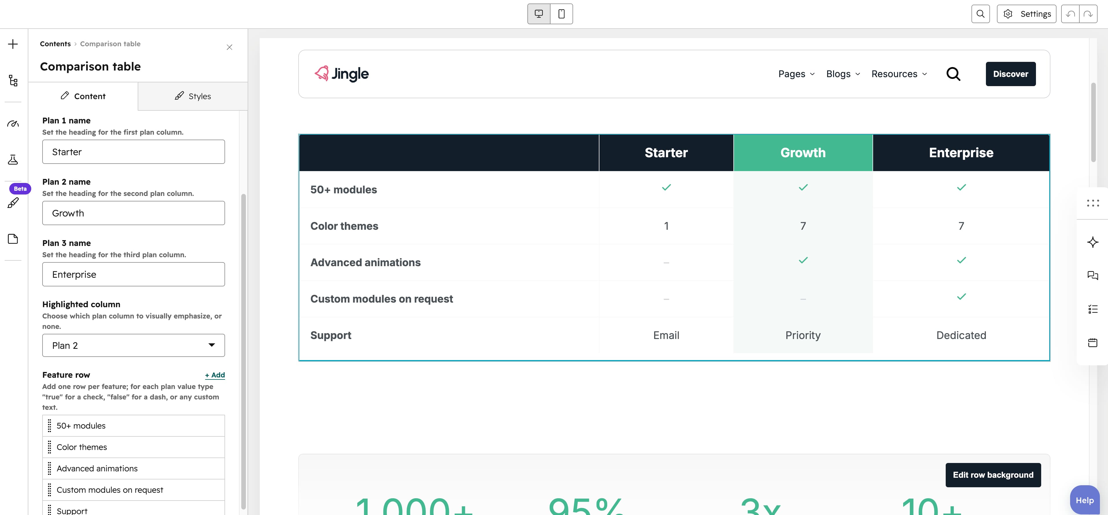
Plan 1 name
The Plan 1 name text field heads the first plan column (default Starter).
Plan 2 name
The Plan 2 name text field heads the second plan column (default Growth).
Plan 3 name
The Plan 3 name text field heads the third plan column (default Enterprise).
Highlighted column
The Highlighted column select visually emphasises one plan column, offering None, Plan 1, Plan 2 (default) or Plan 3.
Feature row
The Feature row group is repeatable (minimum 1, 5 created by default, no maximum). Each row has a Feature label plus a Plan 1 value, Plan 2 value and Plan 3 value. In any value cell, typing true renders a check icon, false (or empty) renders a dash, and any other text is displayed verbatim.
Accent color
The Accent color select drives the tables highlight color, offering Default, First color, Second color (default), Third color, Fourth color, Fifth color or Gray color.
Animation settings
The Animation settings group animates the module as it scrolls into view. Animation type offers None, Fade in, Fade up (default), Fade down, Fade left, Fade right, Zoom in, Zoom out, Slide up, Slide down, Slide left and Slide right, and when active it reveals Duration (0.1 to 3s, step 0.1, default 0.6s).
Mobile order
The Mobile order slider (min -5, max 5, step 1) shifts the module up or down relative to sibling modules on mobile screens; lower numbers appear first.