
Search results
The Search results module is a companion to the search input that renders the results listing on the content search results page, including the results heading, result items and fallback imagery. It reads the visitors query term and outputs matching content dynamically, so place it on the dedicated search results page to configure how results appear.
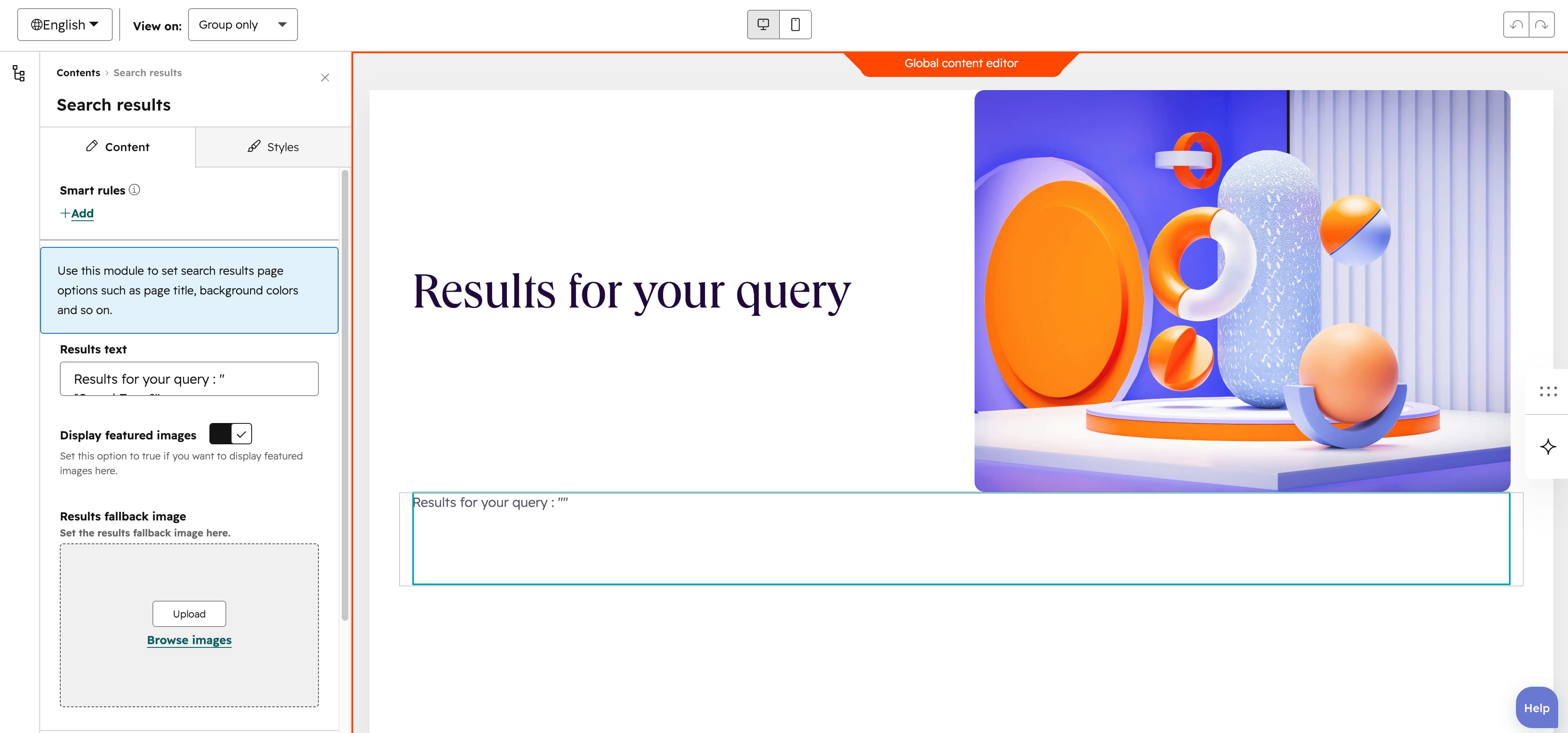
Results text
The Results text field sets the heading shown above the results; the [SearchTerm] token is replaced by the visitors actual query (default Results for your search: "[SearchTerm]").
Display featured images
The Display featured images toggle, on by default, shows each results featured image as a thumbnail; turn it off to hide thumbnails.
Results fallback image
The Results fallback image supplies a default image shown when a result has no featured image, with alt text for accessibility.
Button
The Button group configures the link button on each result. It has Button text (default Discover) and a Use button as anchor toggle (on by default): when on it shows a Target field to scroll to an on-page section, when off it shows a Button URL link. Show icon (off by default) reveals an Icon image, Button style selects Plain (default), Plain reversed, Outline, Text only, White or White reversed, and Make button small (off by default) renders a smaller button.
Vertical alignment
The Vertical alignment group sets vertical alignment for each screen size through the Mobile display, Tablet display and Desktop display selects, each offering Top, Center, Bottom, Space around, Space between and Stretch (default Top).
Horizontal alignment
The Horizontal alignment group sets horizontal alignment for each screen size through the Mobile display, Tablet display and Desktop display selects, each offering Left, Center, Right, Space around, Space between and Stretch (default Left).
Text alignment
The Text alignment group sets text alignment for each screen size through the Mobile display, Tablet display and Desktop display selects, each offering Left, Center and Right (default Left).
Animation settings
The Animation settings group controls how the module animates into view. Animation type offers None (default), Fade in, Fade up, Fade down, Fade left, Fade right, Zoom in, Zoom out, Slide up, Slide down, Slide left and Slide right. Choosing any type other than None reveals Duration (0.1-3s, step 0.1, default 0.6s), Easing (Smooth (power1.out), Default (power2.out) [default], Snappy (power3.out), Very snappy (expo.out), Sine (sine.out), Overshoot (back.out), Springy (elastic.out), Bouncy (bounce.out) or Linear (none)) and Delay (0-5s, step 0.05, default 0s), while Travel distance (0-200px, step 5, default 30px) appears only for slide and directional fade animations.
Mobile order
The Mobile order slider ranges from -5 to 5 in steps of 1 and lets you shift the module up or down relative to sibling modules on mobile screens; lower numbers appear first.