
Blog social sharing
The Blog social sharing module displays a set of share buttons that let visitors post the current page to social networks. It supports Facebook, Twitter, and Linkedin, building the correct share URL for each from the pages address and title. Use it on blog posts or listing pages to encourage sharing.
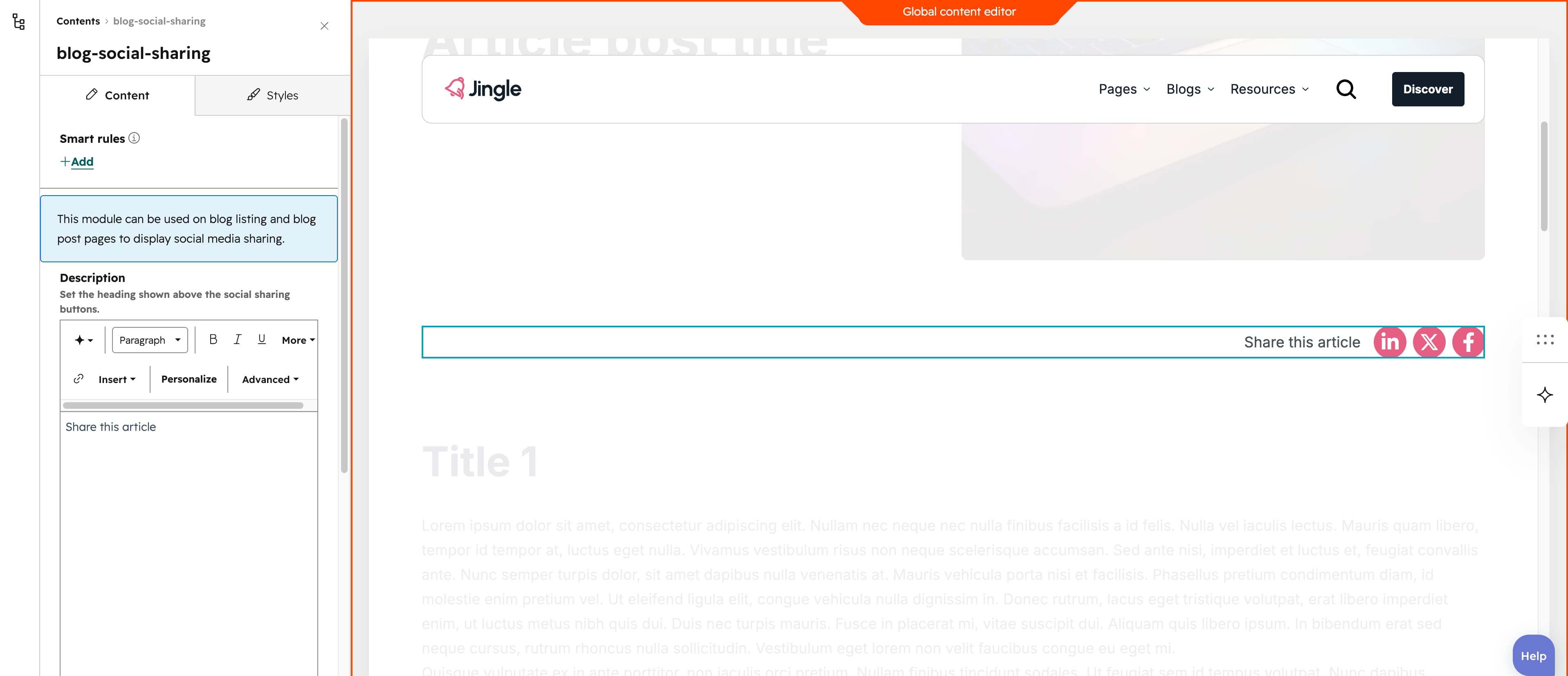
Description
A rich-text Description field sets the heading shown above the share buttons. It defaults to Share this article and accepts any formatted rich text, so you can change the wording, styling or remove it entirely.
Social media
The Social media group is repeatable with a minimum of 1 entry, no maximum and 4 entries created by default, so you can add as many share buttons as you want. Each entry combines a Social media select whose choices are Facebook, Twitter and Linkedin (default Facebook) to generate the proper share link, and a Social icon field that picks the Font Awesome icon shown (default Facebook F).
Vertical alignment
The Vertical alignment group exposes distinct Mobile display, Tablet display and Desktop display selects so each screen size can differ. Every select offers Top, Center, Bottom, Space around, Space between and Stretch, and all three default to Top.
Horizontal alignment
The Horizontal alignment group exposes distinct Mobile display, Tablet display and Desktop display selects so each screen size can differ. Every select offers Left, Center, Right, Space around, Space between and Stretch, and all three default to Left.
Text alignment
The Text alignment group exposes distinct Mobile display, Tablet display and Desktop display selects so each screen size can differ. Every select offers Left, Center and Right, and all three default to Left.
Animation settings
The Animation settings group controls how the module animates into view. Animation type offers None (default, disables the animation), Fade in, Fade up, Fade down, Fade left, Fade right, Zoom in, Zoom out, Slide up, Slide down, Slide left and Slide right. When a type other than None is chosen, Duration (0.1s to 3s, step 0.1s, default 0.6s), Easing (Smooth (power1.out), Default (power2.out) — the default, Snappy (power3.out), Very snappy (expo.out), Sine (sine.out), Overshoot (back.out), Springy (elastic.out), Bouncy (bounce.out) and Linear (none)) and Delay (0s to 5s, step 0.05s, default 0s) appear. Travel distance (0px to 200px, step 5px, default 30px) is shown only for the slide and directional fade animations, staying hidden for None, Fade in, Zoom in and Zoom out.
Mobile order
The Mobile order slider runs from -5 to 5 in steps of 1 and lets you shift the module up or down relative to sibling modules on mobile screens; lower numbers appear first.